
advisor
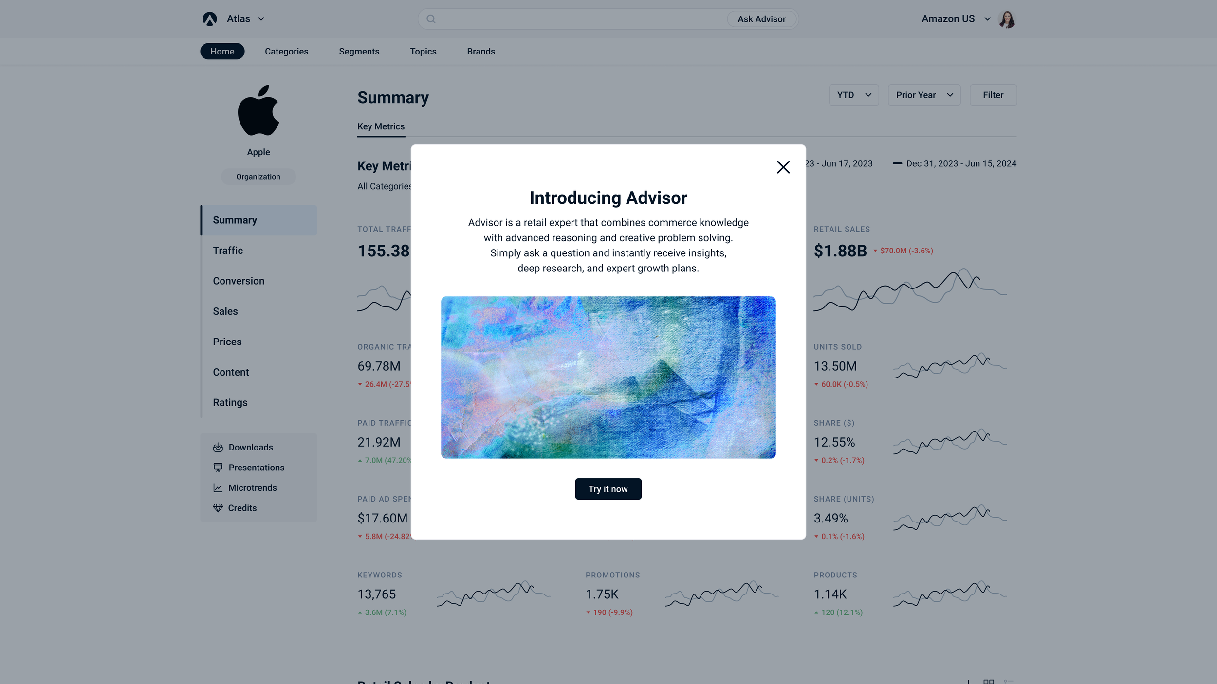
Advisor is a retail expert that combines commerce knowledge with advanced reasoning, and creative problem solving.
Service: Product Design

Overview:
Advisor is a superintelligent business partner with access to all commerce data so users can instantly receive insights, deep research, and expert growth plans.
Problem:
Retail brands have access to more data than ever but turning that data into clear direction remains slow and manual. Stackline was looking to provide a new AI-driven platform that consolidated this information for users so that they could gain back time and make more informed decisions with the help of our data.
Goal:
Stackline's vast data was overpopulated with data knowledge. Users found that generating meaningful insights required far too much time and manual effort causing most valuable data to be inaccessible.
Tools Used:
Figma, Claude Design, Cursor, Lovable
Team:
Isabelle Iwatsubo
Subhadeep Chakraborty
Chris Zhou
Michael Lagoni
Raj Ramasamy
Patrick Leake
Joungwoo Baik
Timeline:
Launch: 2 months
Sprints: 1 month
Outcome:
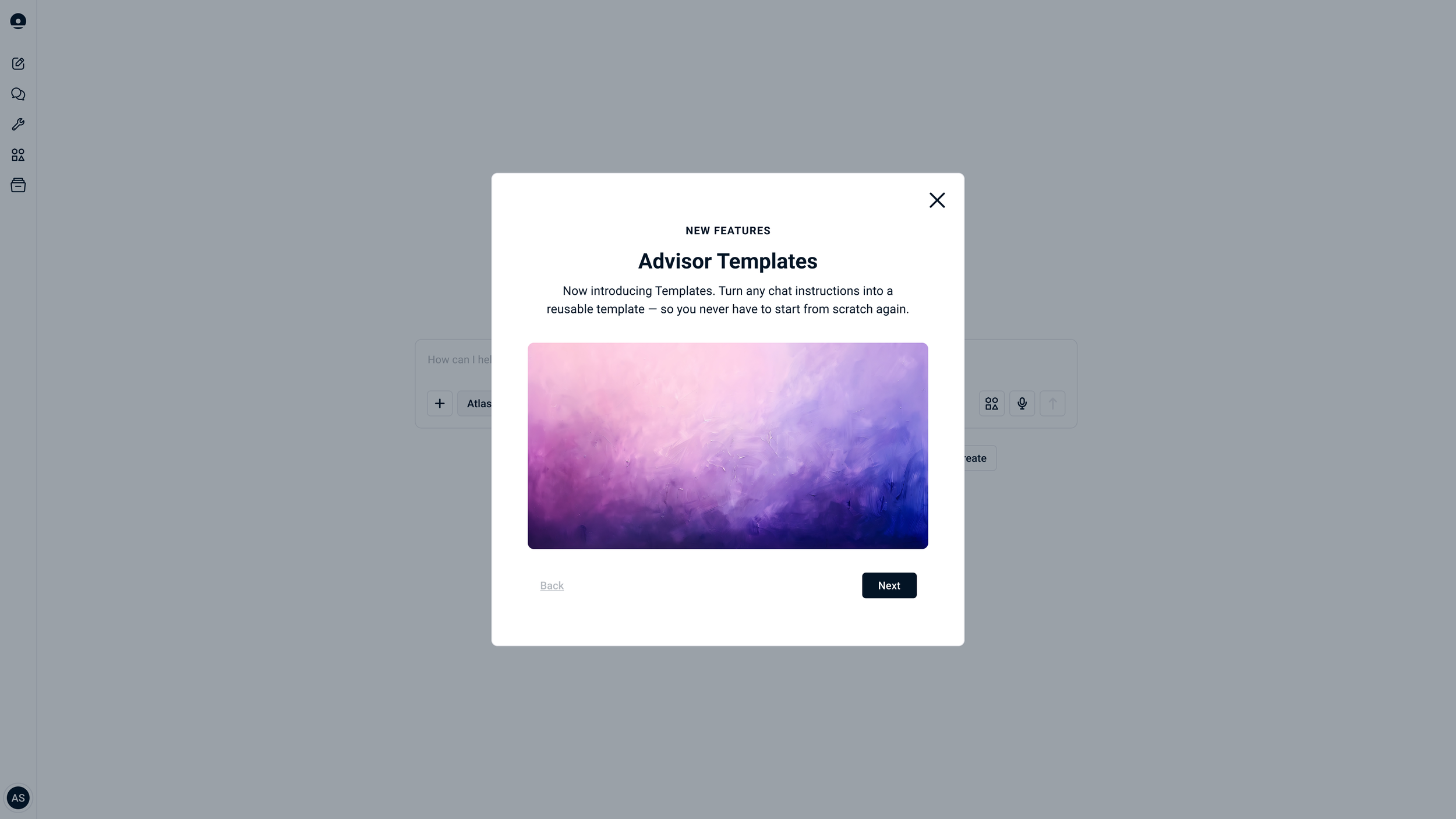
Designed and shipped Stackline's AI-powered commerce intelligence platform from zero to launch in approximately two months — owning the full design system, chat interface, data visualization components, template builder, and mobile experience. Built in close collaboration with engineering and product using Figma and Claude's Figma integration, iterating across monthly feature sprints post-launch. Advisor translates Stackline's vast retail dataset into instant, actionable insights for enterprise brands.

Mood Board
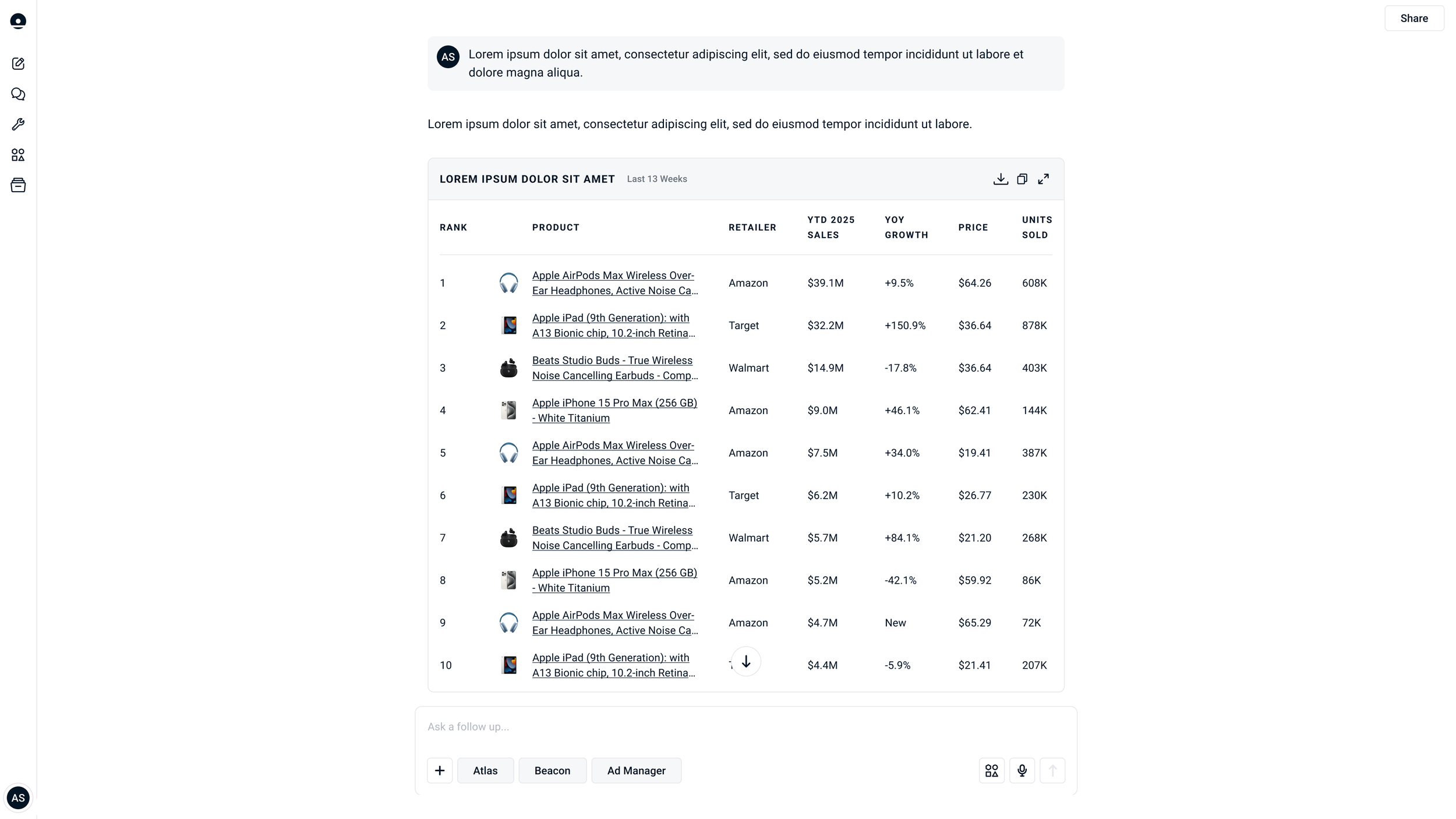
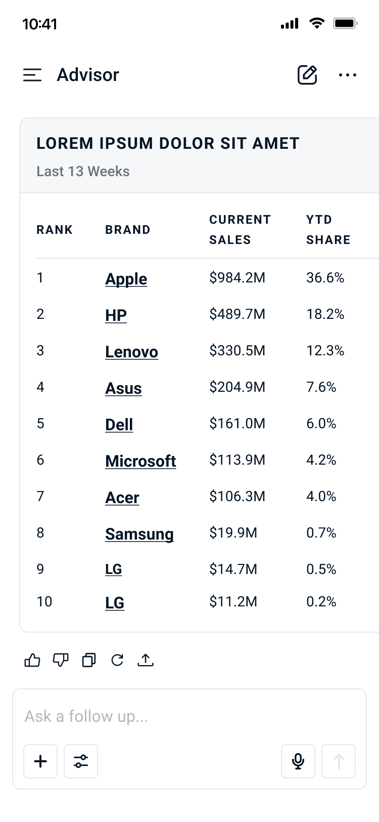
Clean visualizations that highlight insights
Prioritize data content
Actionable content
Intuitive user flows
Color
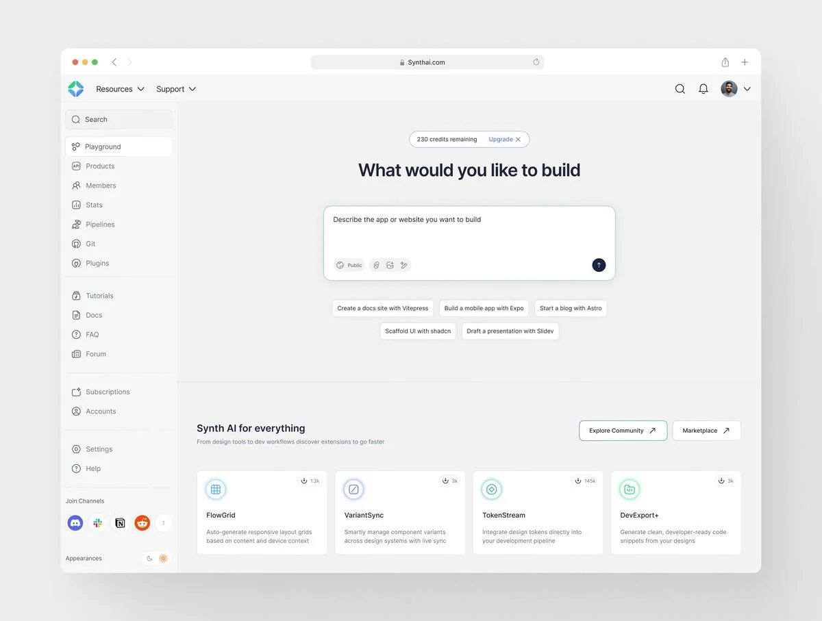
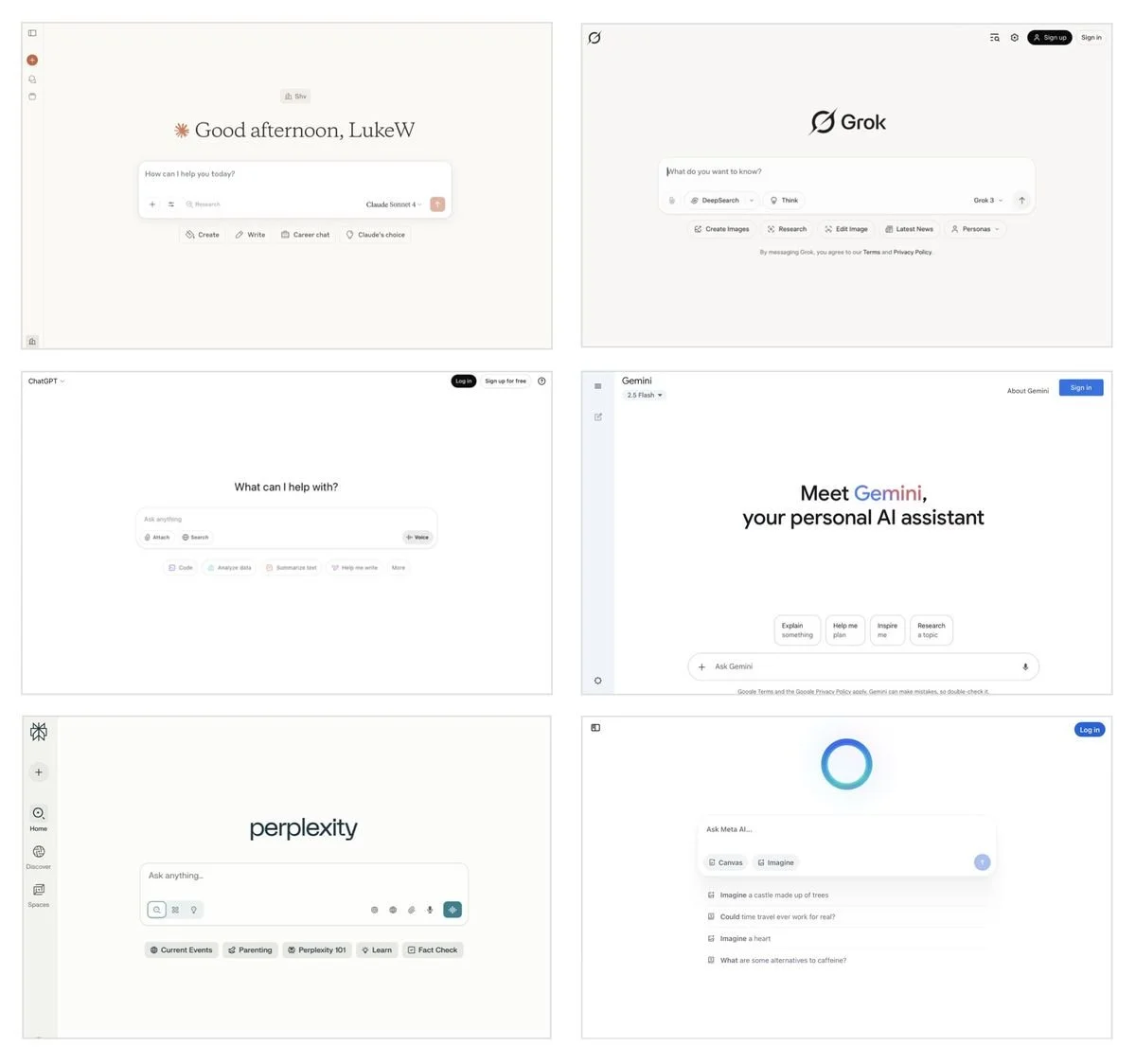
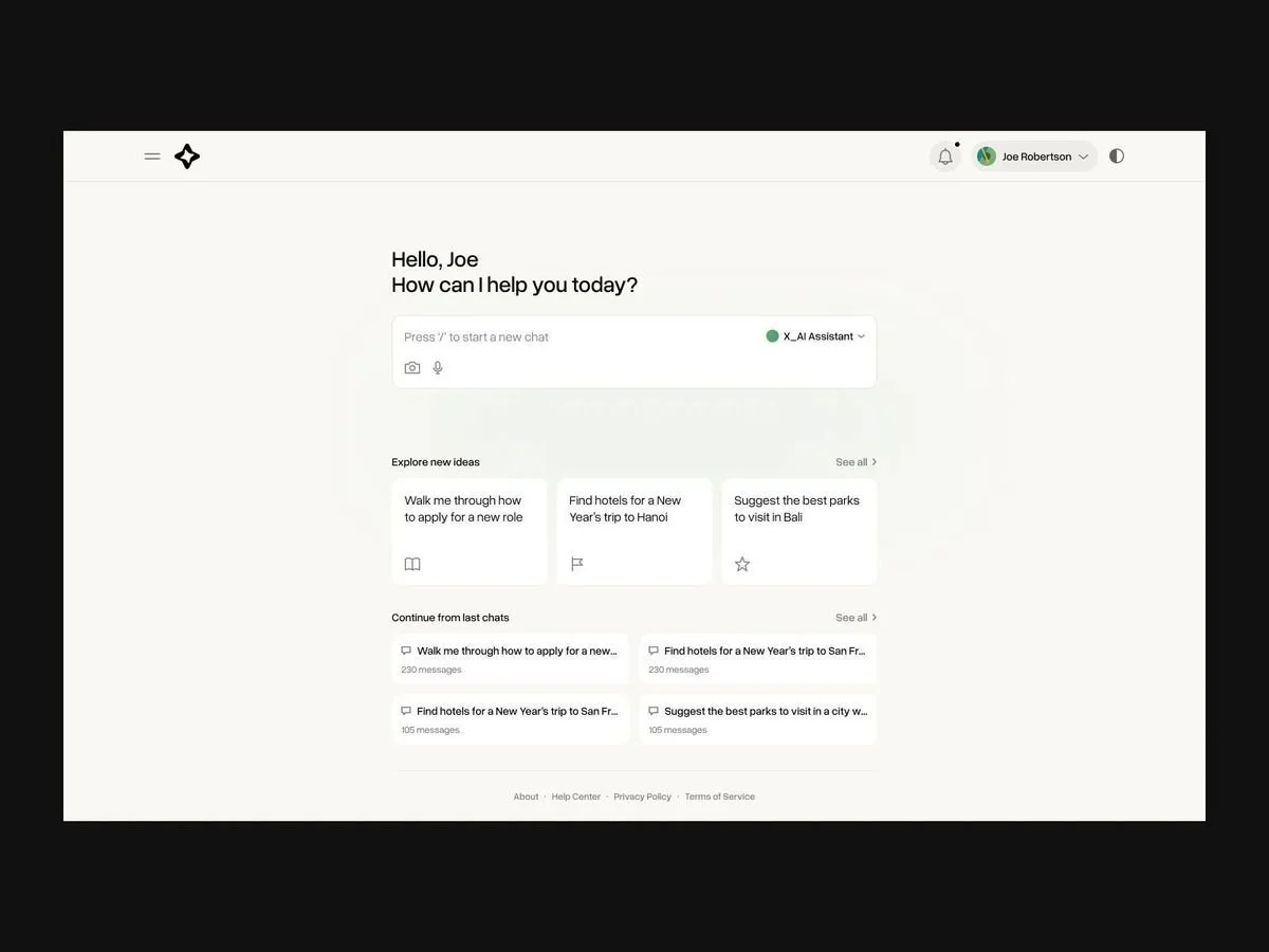
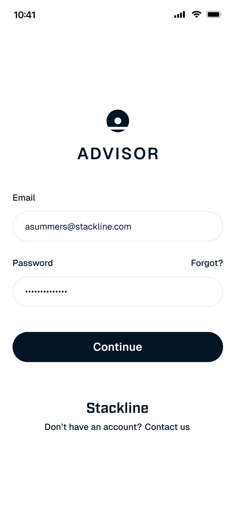
The color palette centers itself around the rebranded Stackline blue color. The Stackline blue appears to be nearly black, but emphasizes the modernness of the company while not detracting from the data that is meant to be highlighted. The product remains mainly black and white monochromatic to mirror the aesthetic language of trusted AI products like ChatGPT and Perplexity, creating an immediate sense of familiarity and confidence for users.
Typography
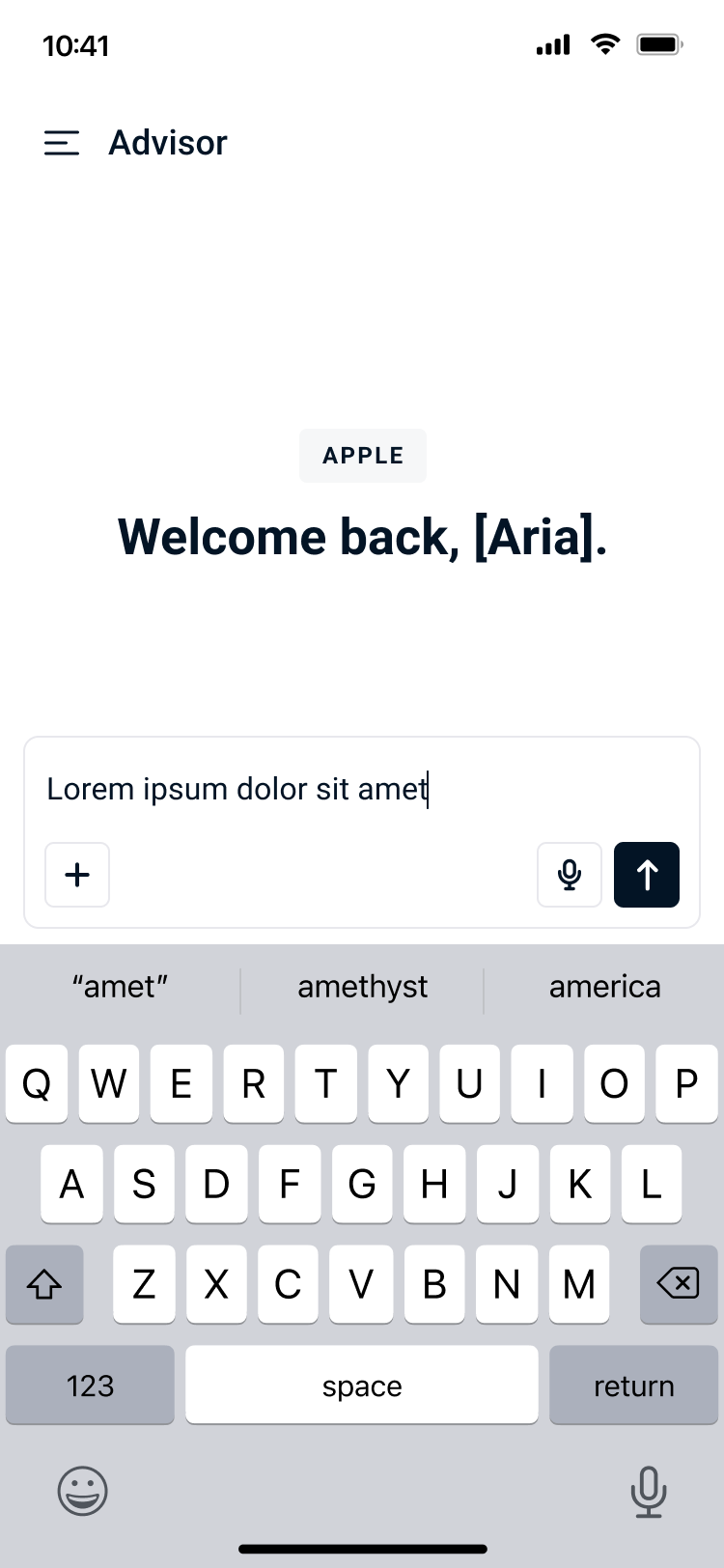
Advisor's type system is built on Roboto in order to remain in harmony with the rest of Stackline’s products. This font, chosen for its clean, geometric structure and strong legibility across data-heavy interfaces, shows versatility across weights and makes it well-suited for an AI chat experience where both hierarchy and clarity are critical to users.
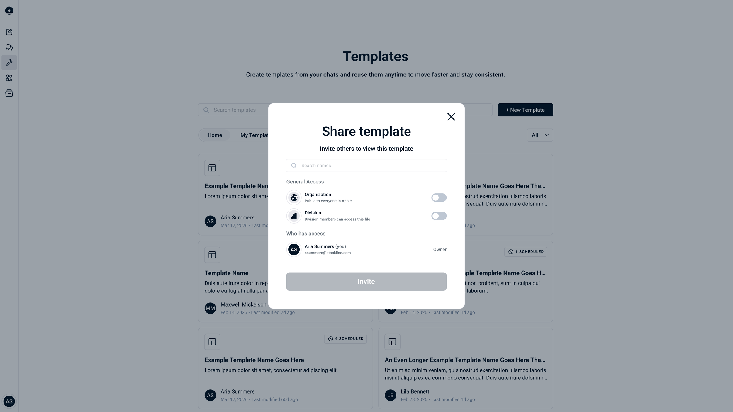
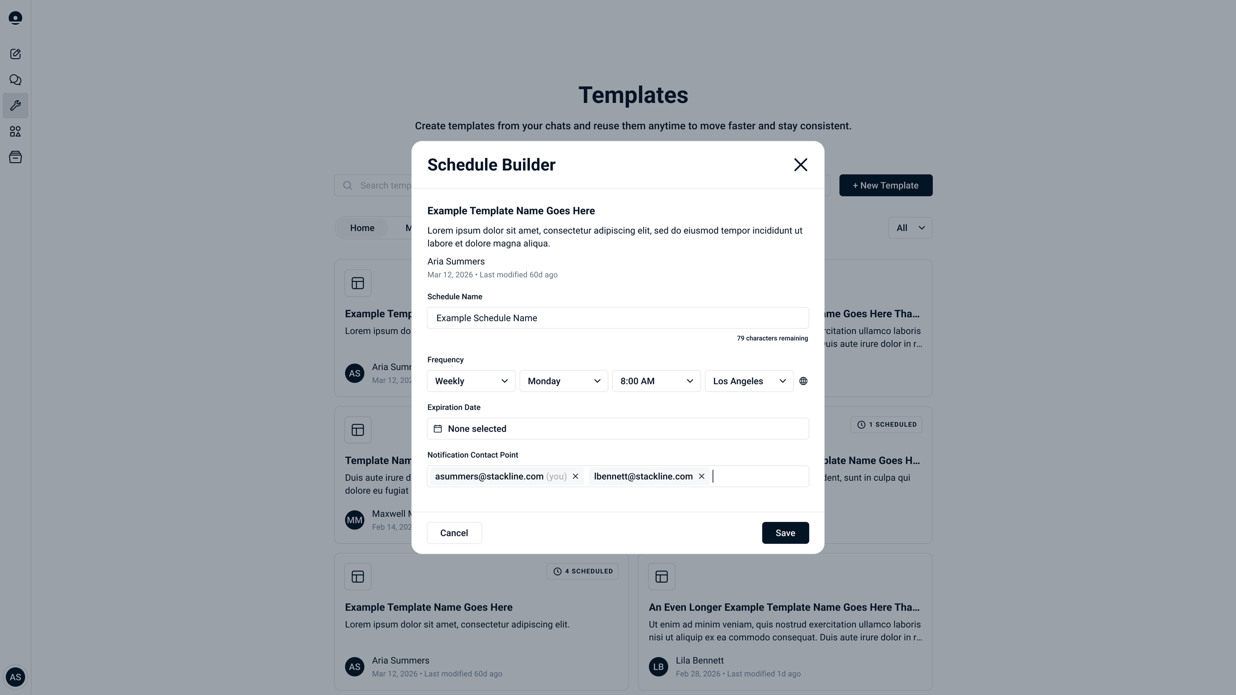
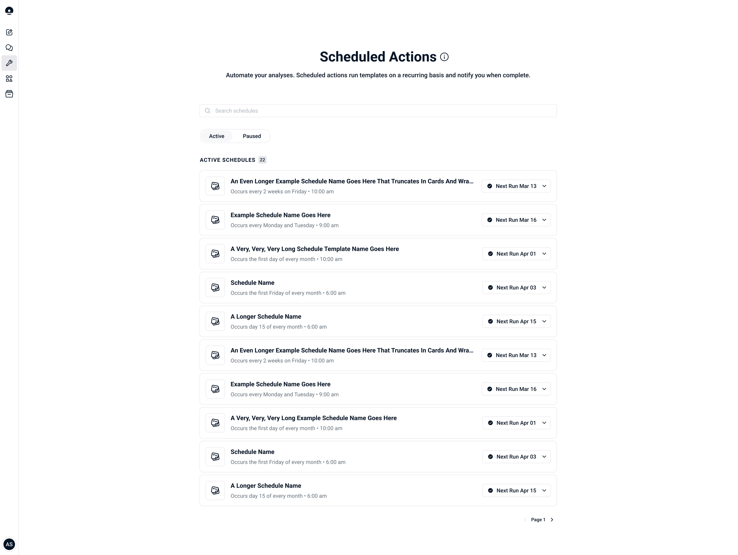
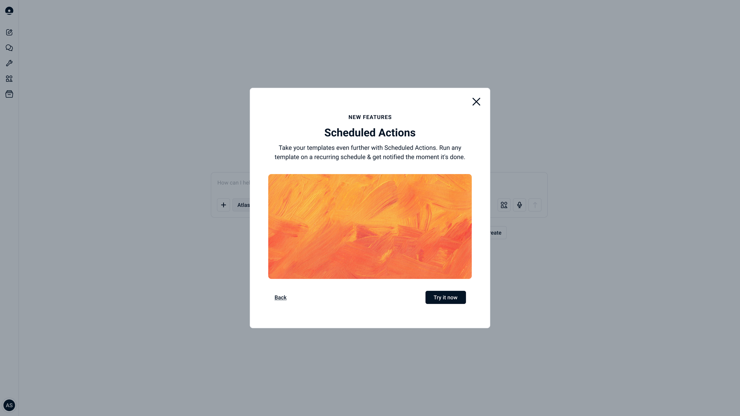
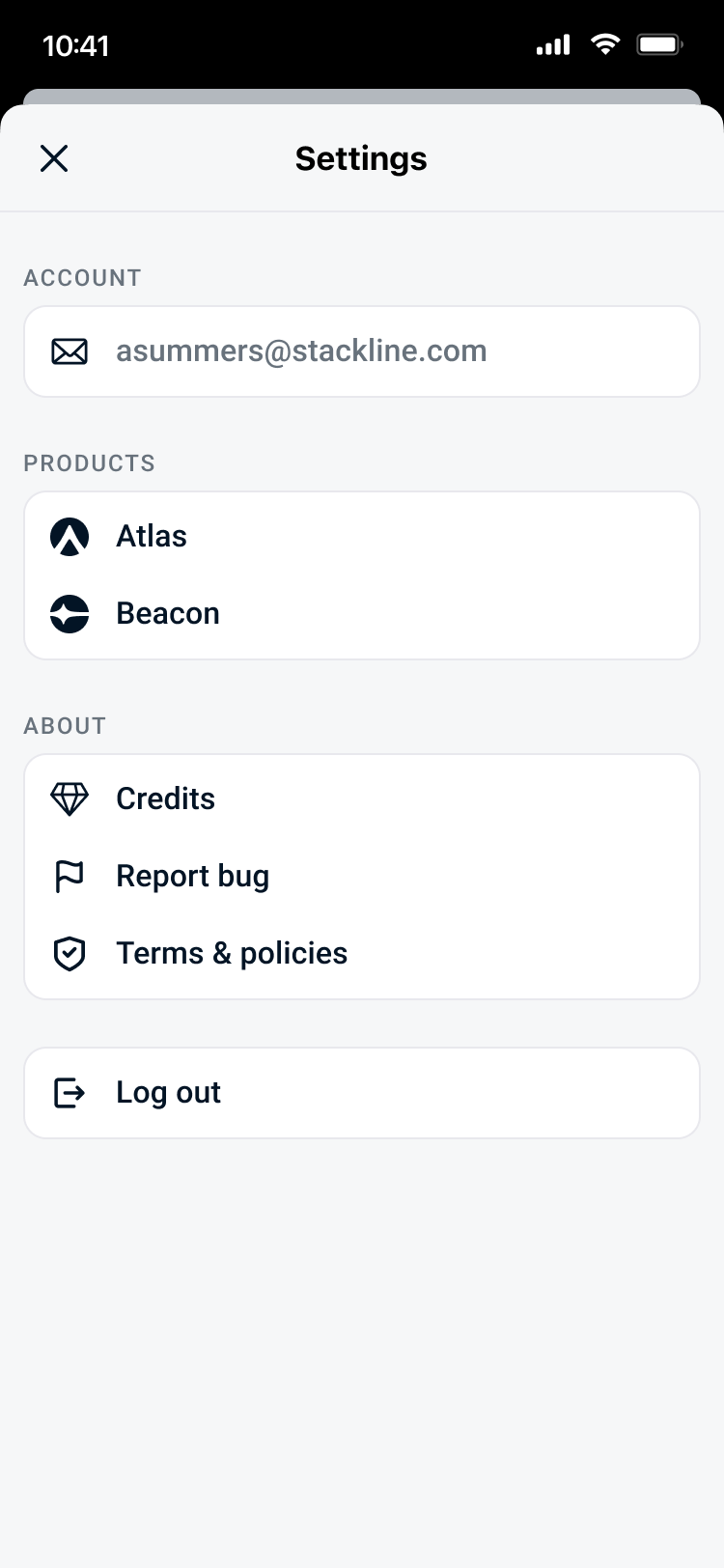
UI Elements
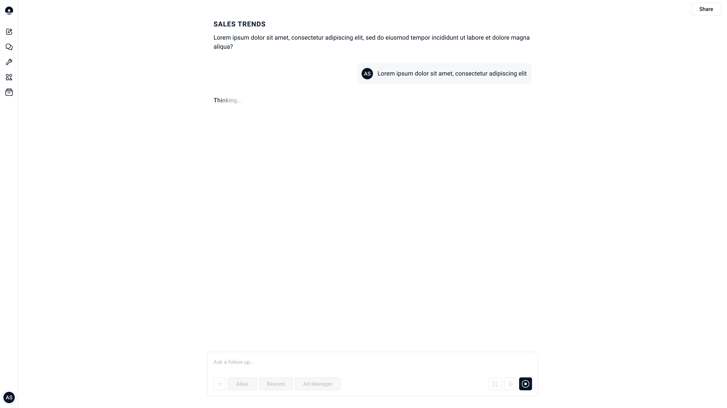
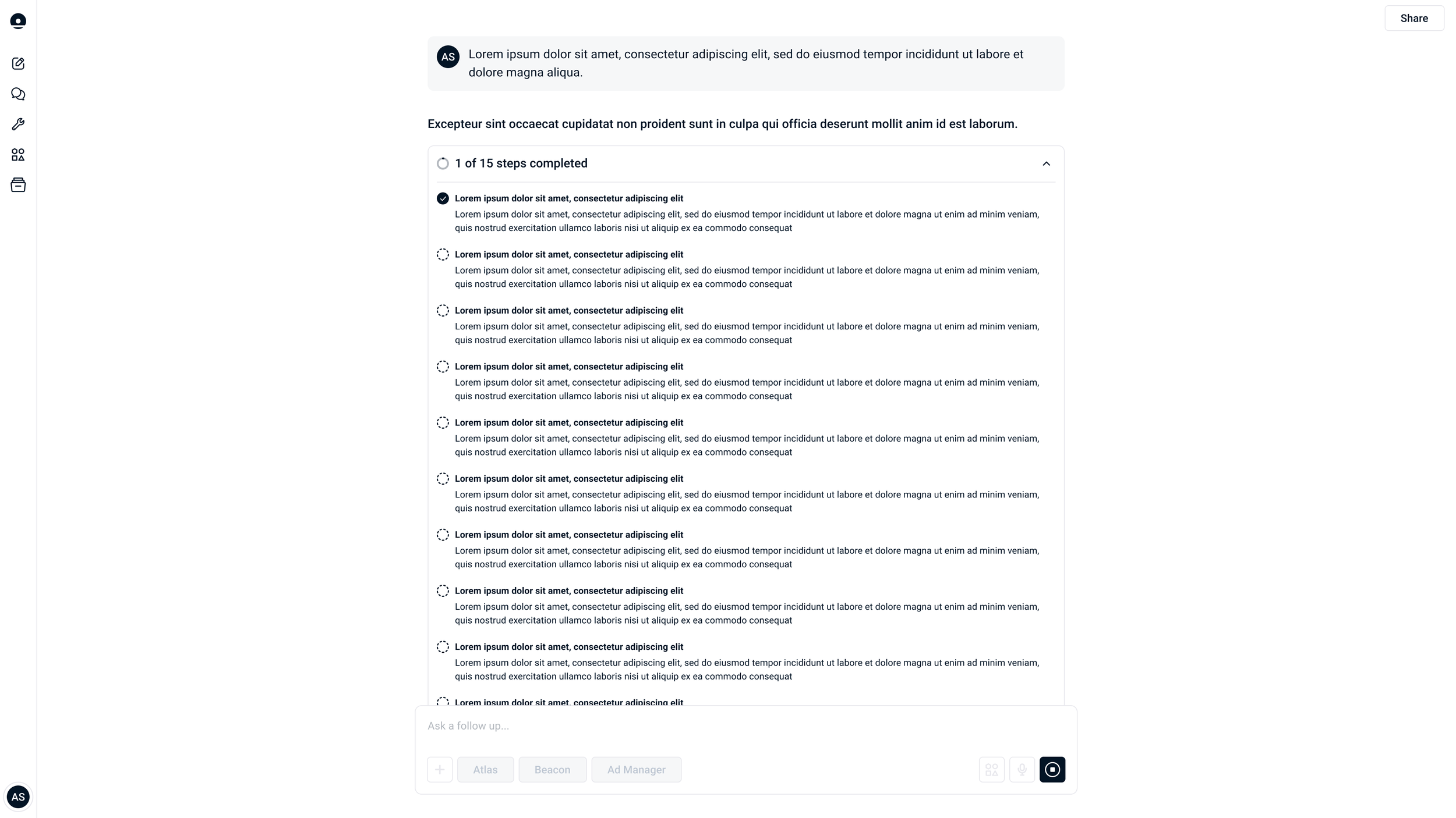
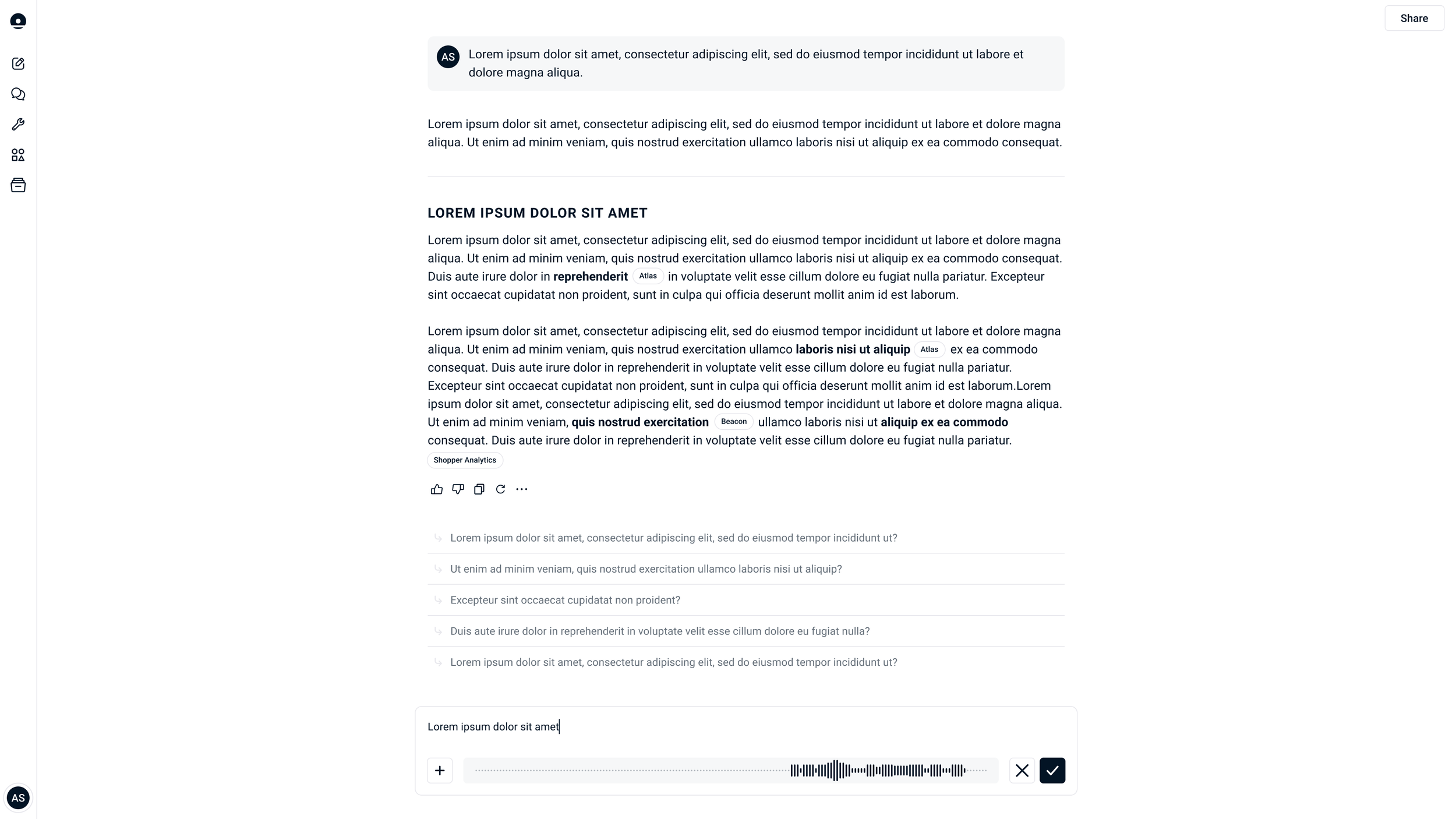
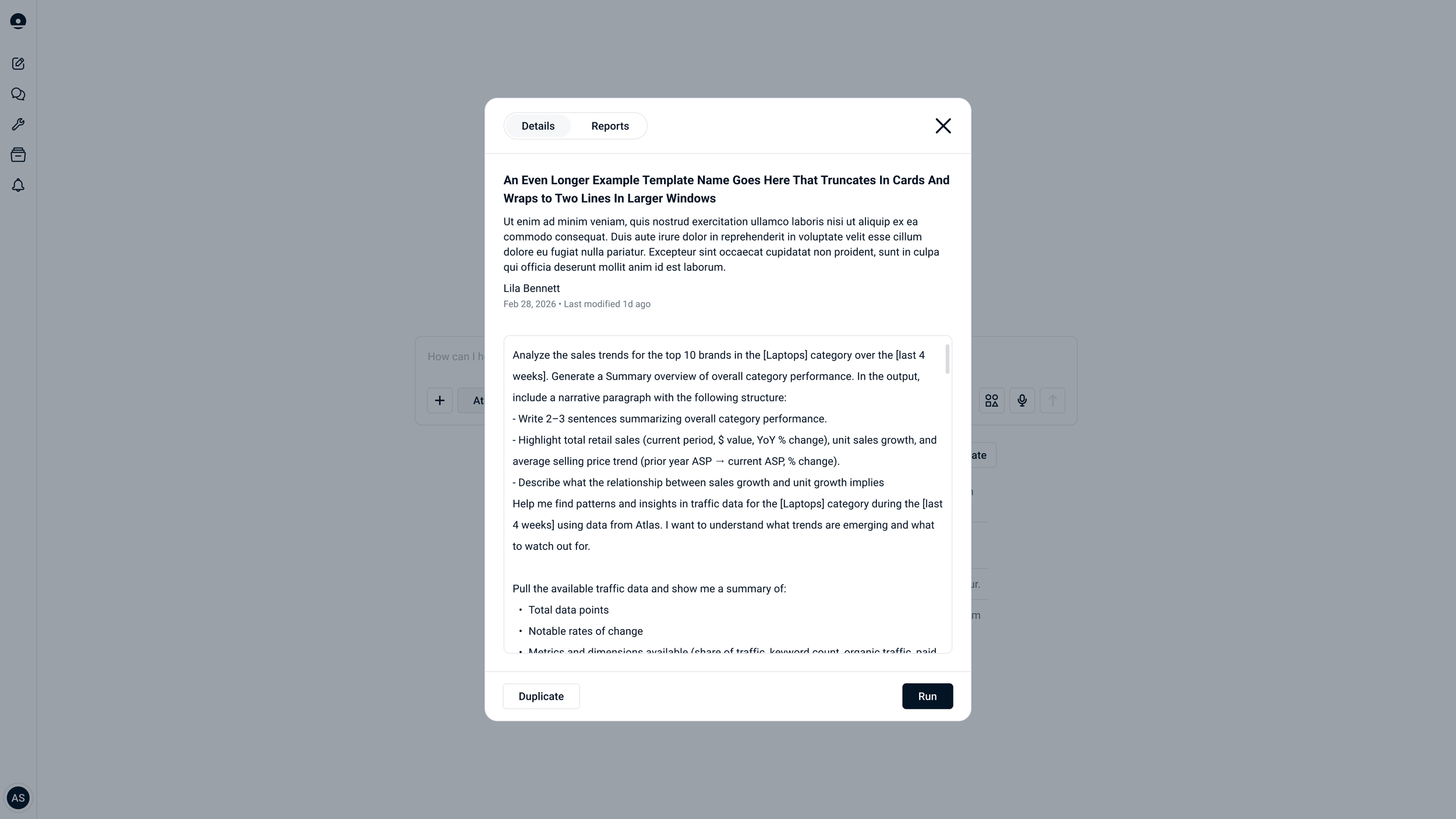
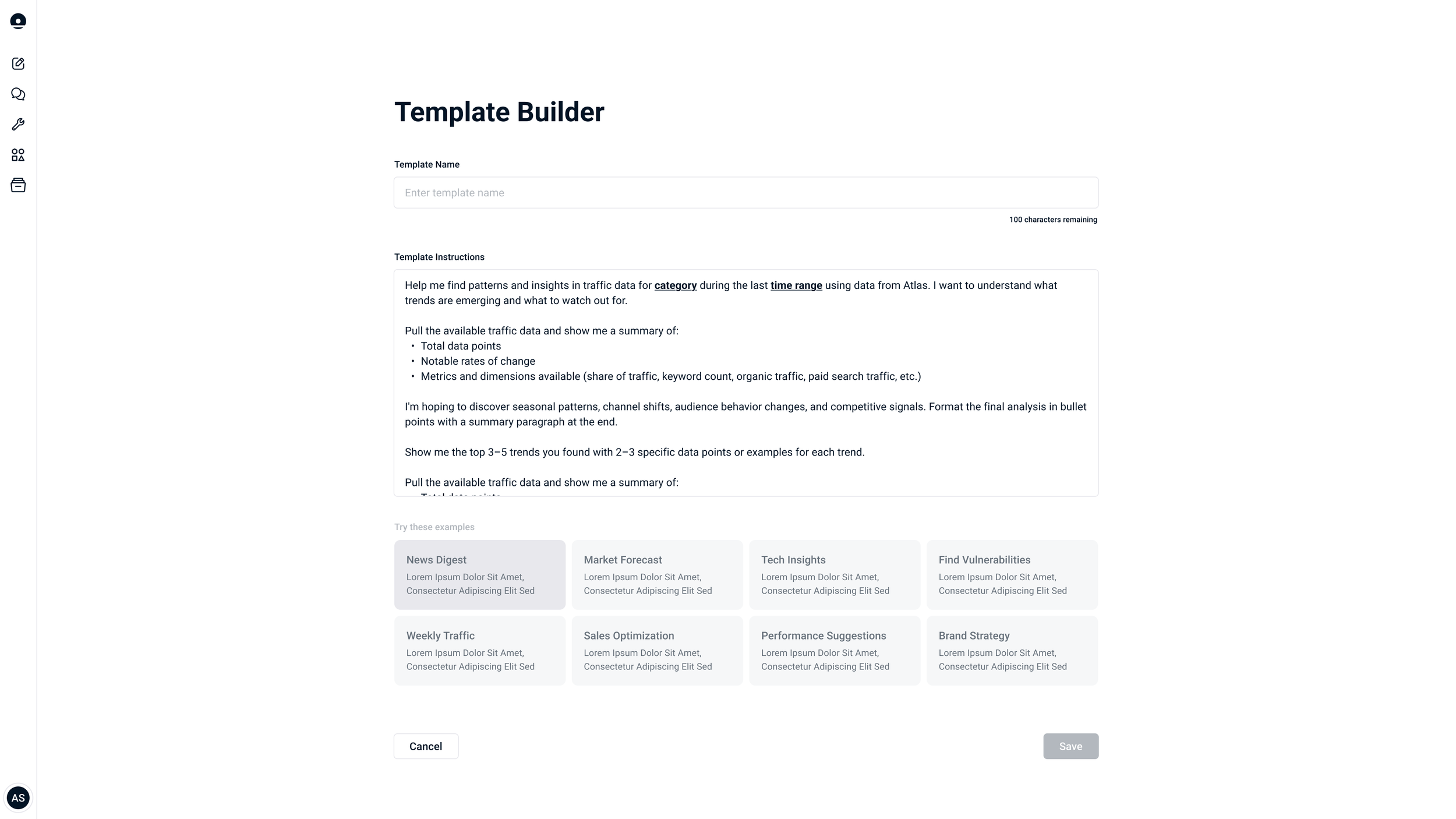
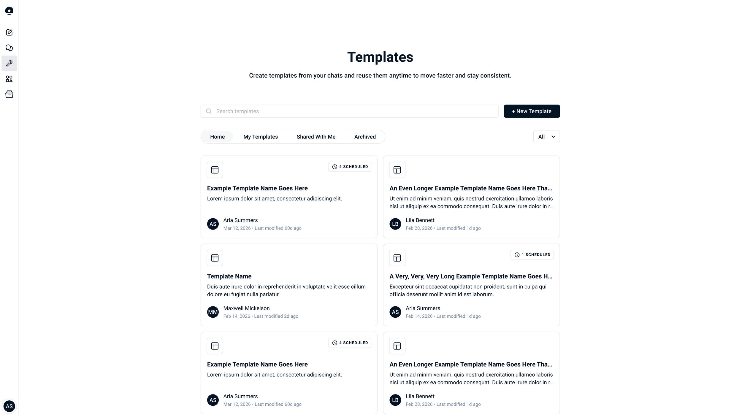
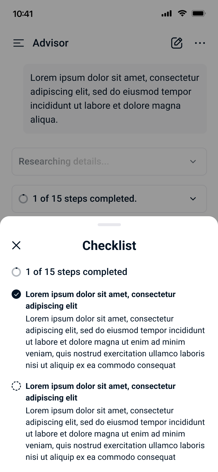
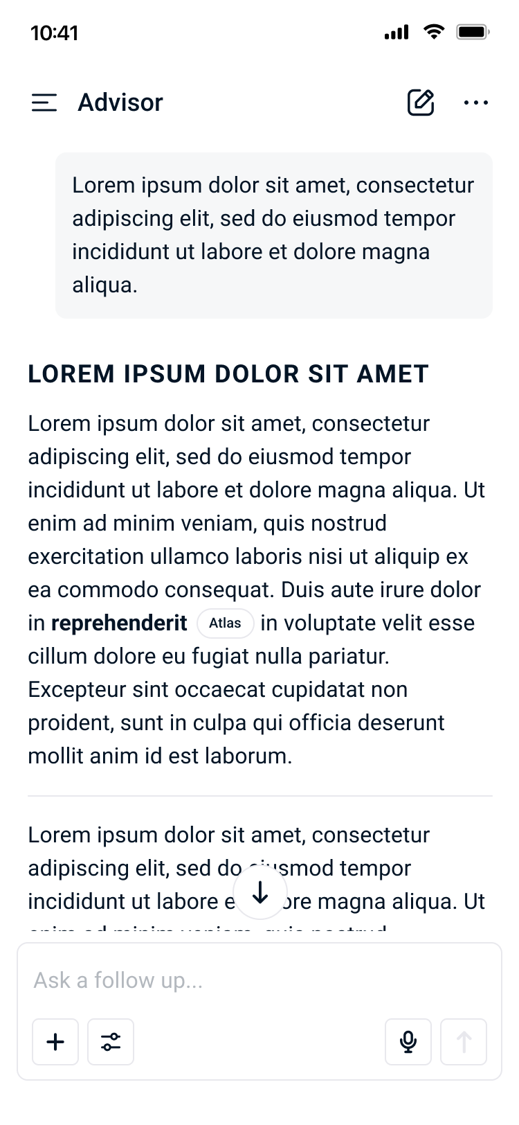
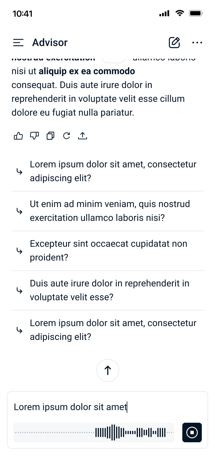
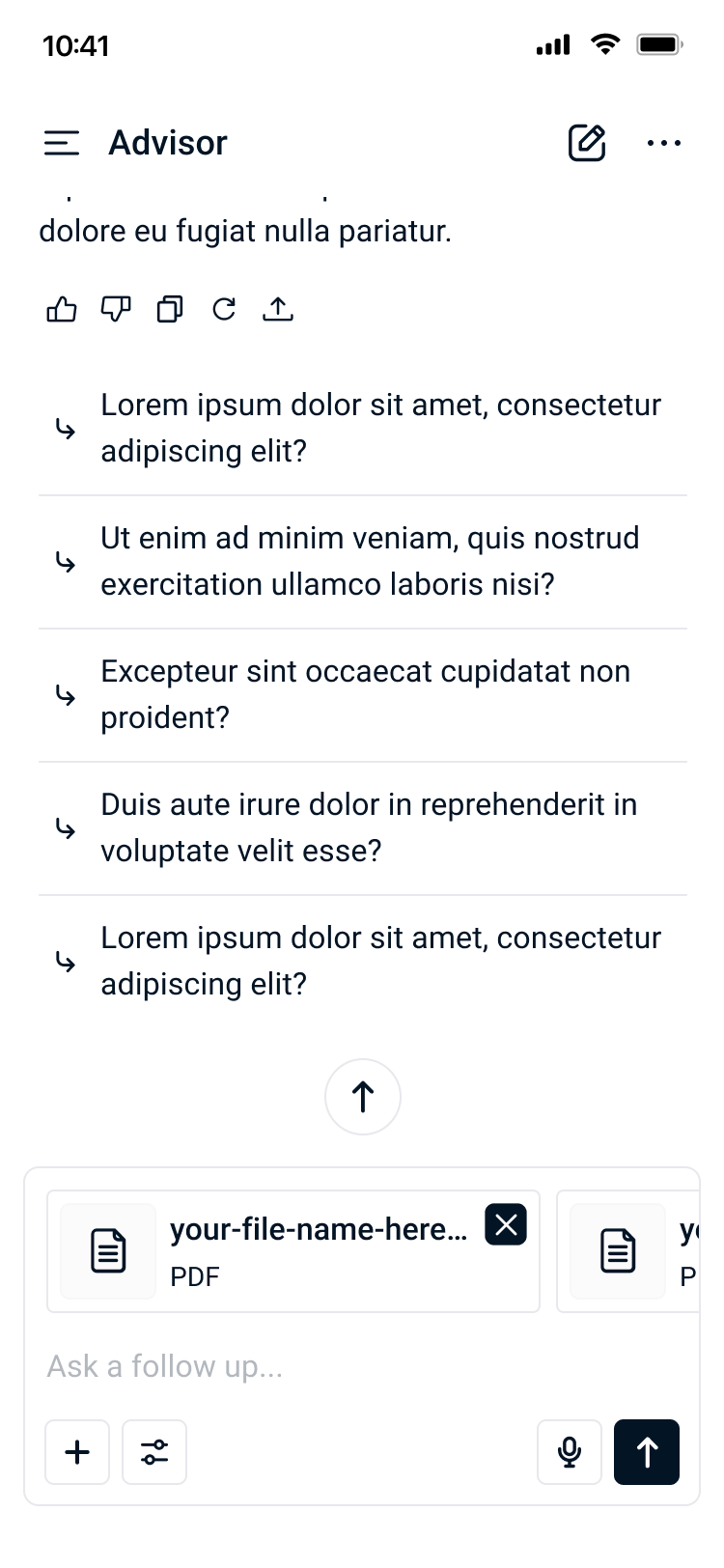
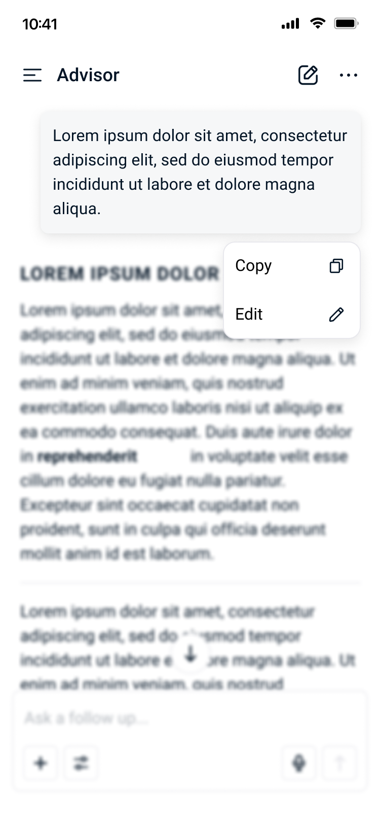
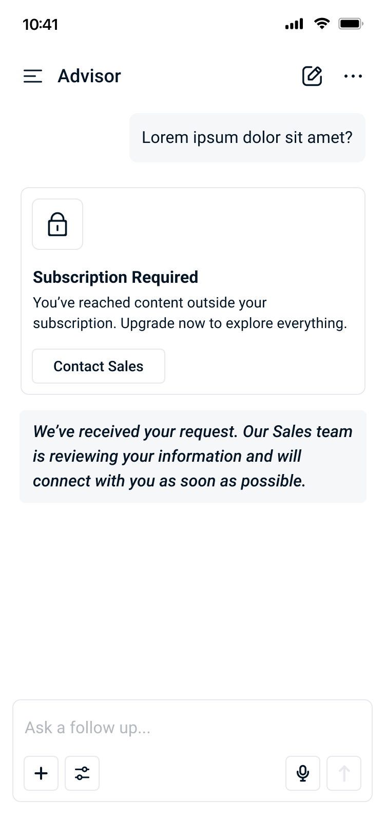
Advisor's UI elements were designed to feel native to both Stackline's existing platform and the familiar patterns of modern AI chat interfaces. Every component was built with clarity and function in mind, ensuring that the interface stayed out of the way and let the data speak while supporting wayfinding for users.
Challenge ✹ Solution
overpopulated
Reduced noise that detracted from the data
Introduced scannable sections with insights
Directed users’ attention with hierarchy
too much time & manual effort
Leveraged AI in user flow
Guided users with prompt chat suggestions
Streamlined chat flow to allow for iteration
inaccessible
Built familiar interface for learning curve
Streamlined information to users
Generated trust using Stackline data
Design System
setting the stage
Stackline’s CTO and CEO brought forward the core problems and vision, establishing the strategic direction that would set Stackline apart. Engineering leveraged Cursor to rapidly formulate a baseline flow, drawing on existing AI platforms as reference points for interaction patterns users would already recognize. From that foundation, design, engineering, and product management aligned closely to define the problem space, establish the user persona, and chart a path forward.
Bridging the Gap
With a baseline in place, design stepped in to refine the experience. I translated the functional skeleton into something that felt native to Stackline's design system and reflected the elegance and sophistication the brand is known for. A major north star throughout this phase was accessibility. The team worked hard to ensure that Advisor could serve both power users and those entirely new to AI tooling, making sure groundbreaking features never came at the cost of usability. I utilized Claude’s Figma integration to keep with the short timeline.
Shipping and Evolving
Once flows were refined, the PM validated the experience through user testing, feeding findings back into the design cycle. Front-end engineering built against finalized specs, followed by rigorous QA from design and QC from the PM before each launch. Phase 1 shipped in approximately two months, and the product continues to grow through one-month sprints with each cycle pushing Advisor further as the team deepens its understanding of how users engage with the tool.
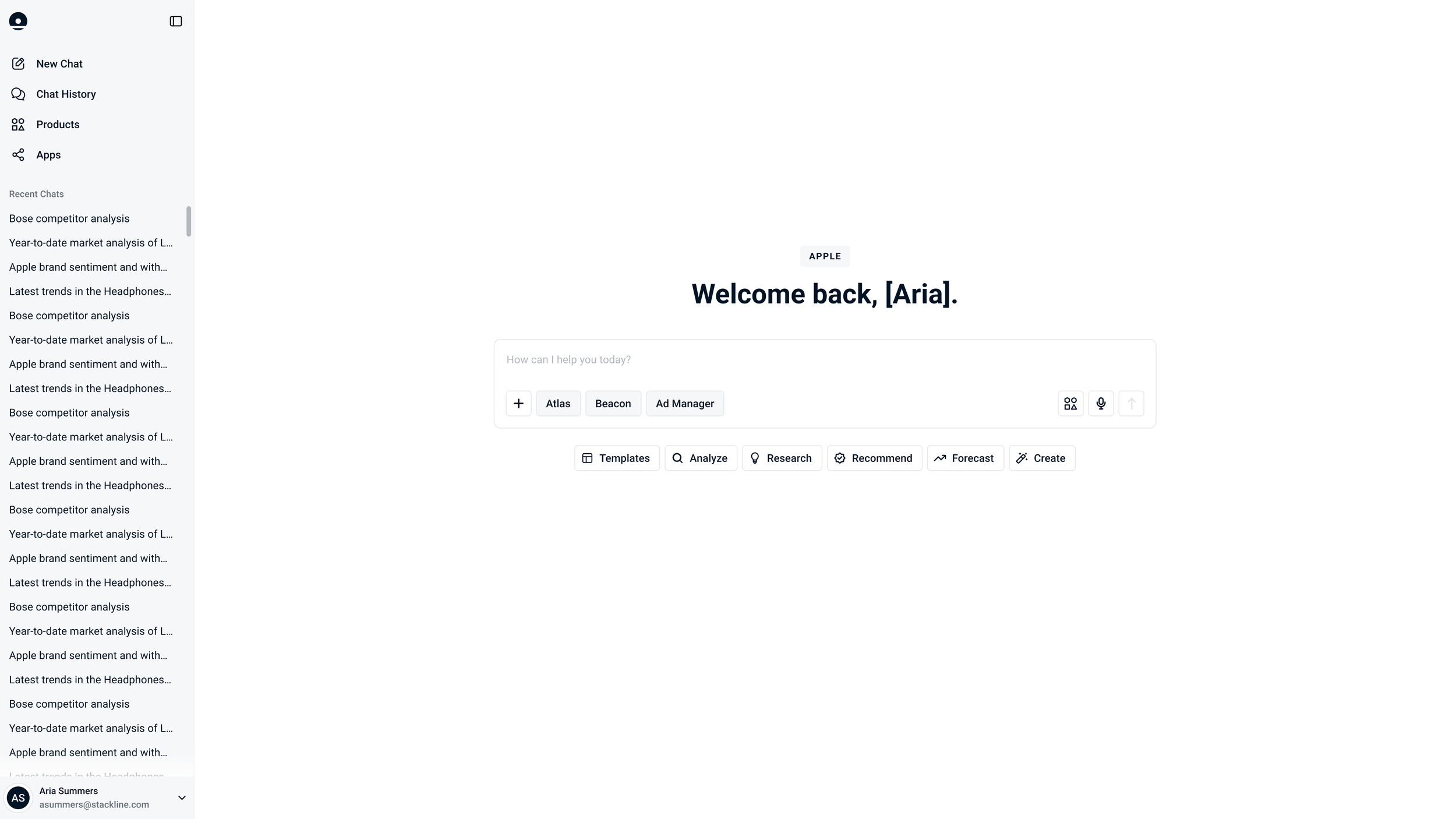
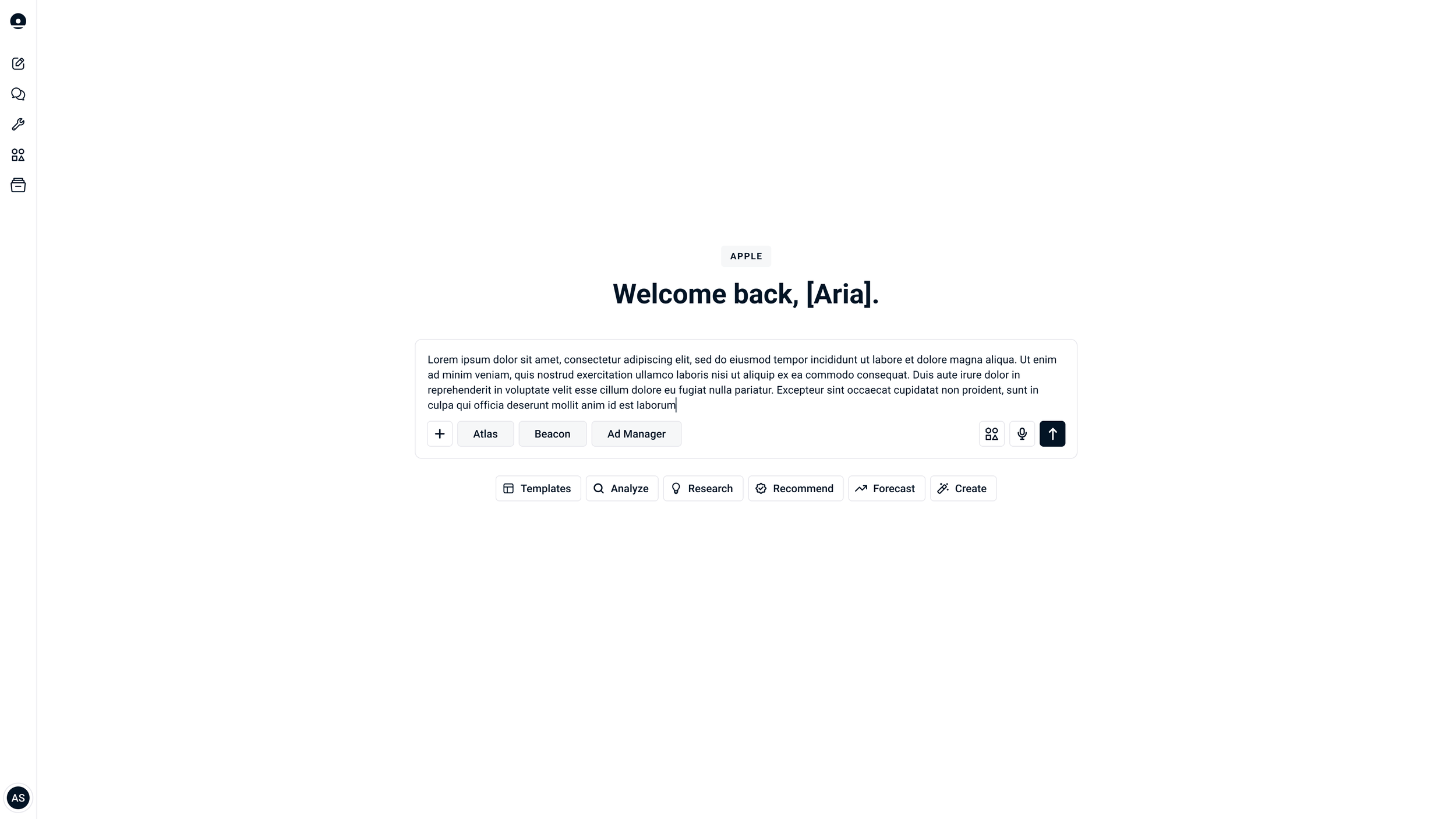
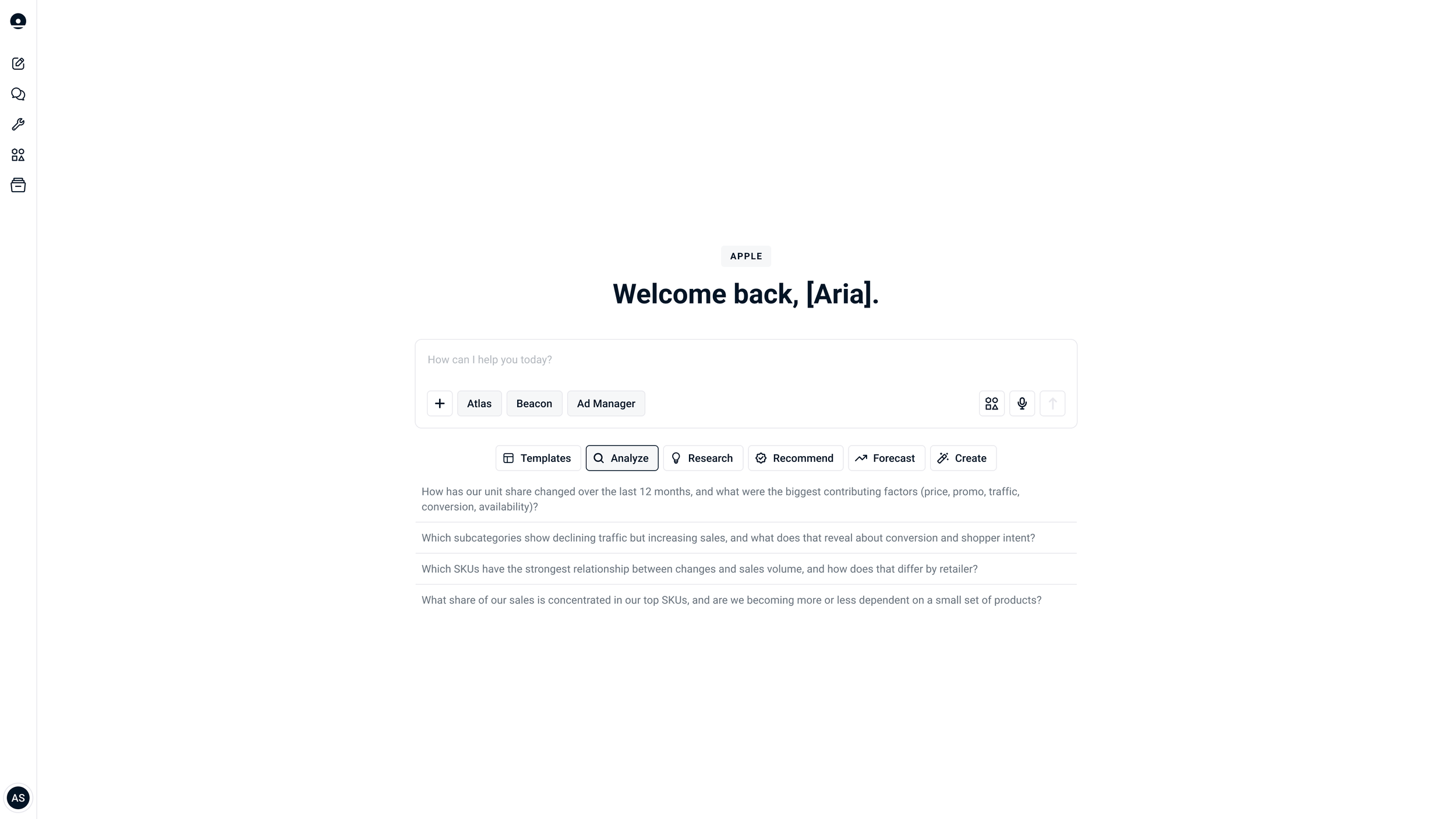
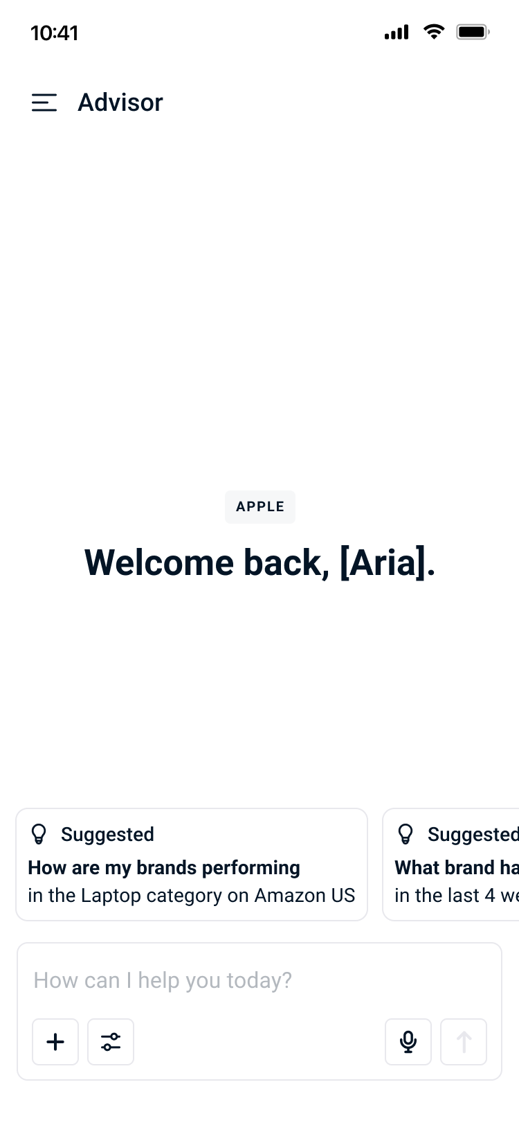
![Screenshot of a website homepage with a greeting 'Welcome back, [Aria].' and various options such as templates, research, forecast, create, analyze, recommend, and research.](https://images.squarespace-cdn.com/content/v1/622692744d68e93a7a6d8789/6faa9005-8ef5-47b2-83cb-354957f83ab7/Chat+%5BTemplates+Prompt+Selected%5D.png)
continuity across devices
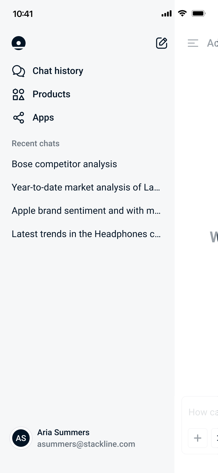
Saved conversations carry over seamlessly, allowing users to pick up exactly where they left off regardless of device. The mobile experience isn't a stripped-down version of Advisor. It's the same intelligent, insight-first tool, refined for a new context. Whether on desktop or mobile, Advisor delivers the same intelligent, insight-first experience.


motion
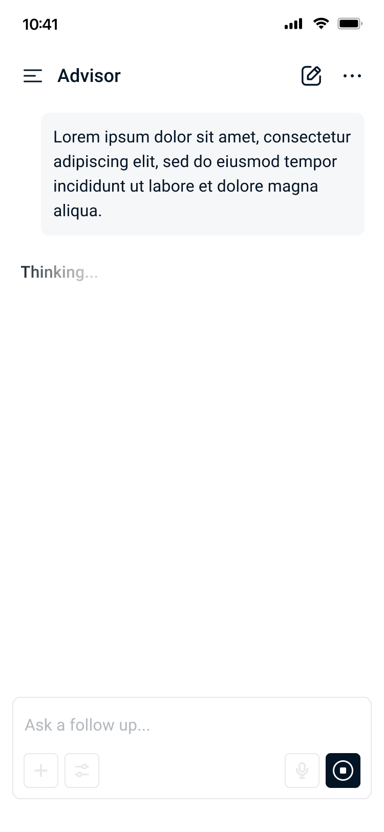
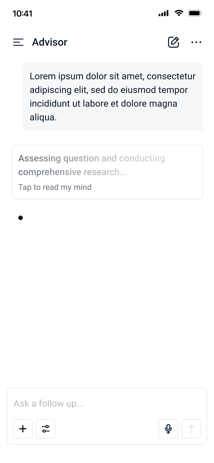
Alive with Intelligence
Every transition and micro-interaction was designed intentionally. Loading states, response reveals, and data visualization entries are choreographed to guide the user's eye and reduce perceived wait time. Motion is never decorative for its own sake but rather it earns its place by making the experience feel faster, smarter, and more alive.
The animations draw inspiration from the visual language of cutting-edge technology including fluid, organic movements that hint at the complexity of the system working behind the scenes. Rather than static responses, insights feel like they are being thoughtfully generated in real time, creating a sense of anticipation and trust in the product.