as*is FILM
as*is film specializes in 35mm film photography and creative direction services in the Greater Seattle Area. They’re inspired by editorial photoshoots with strong themes that embrace a niche. The company utilizes the warmth and authenticity that analog film photography creates to capture the client’s creative vision, as is. Check out as*is here!

Service: brand design Overview:
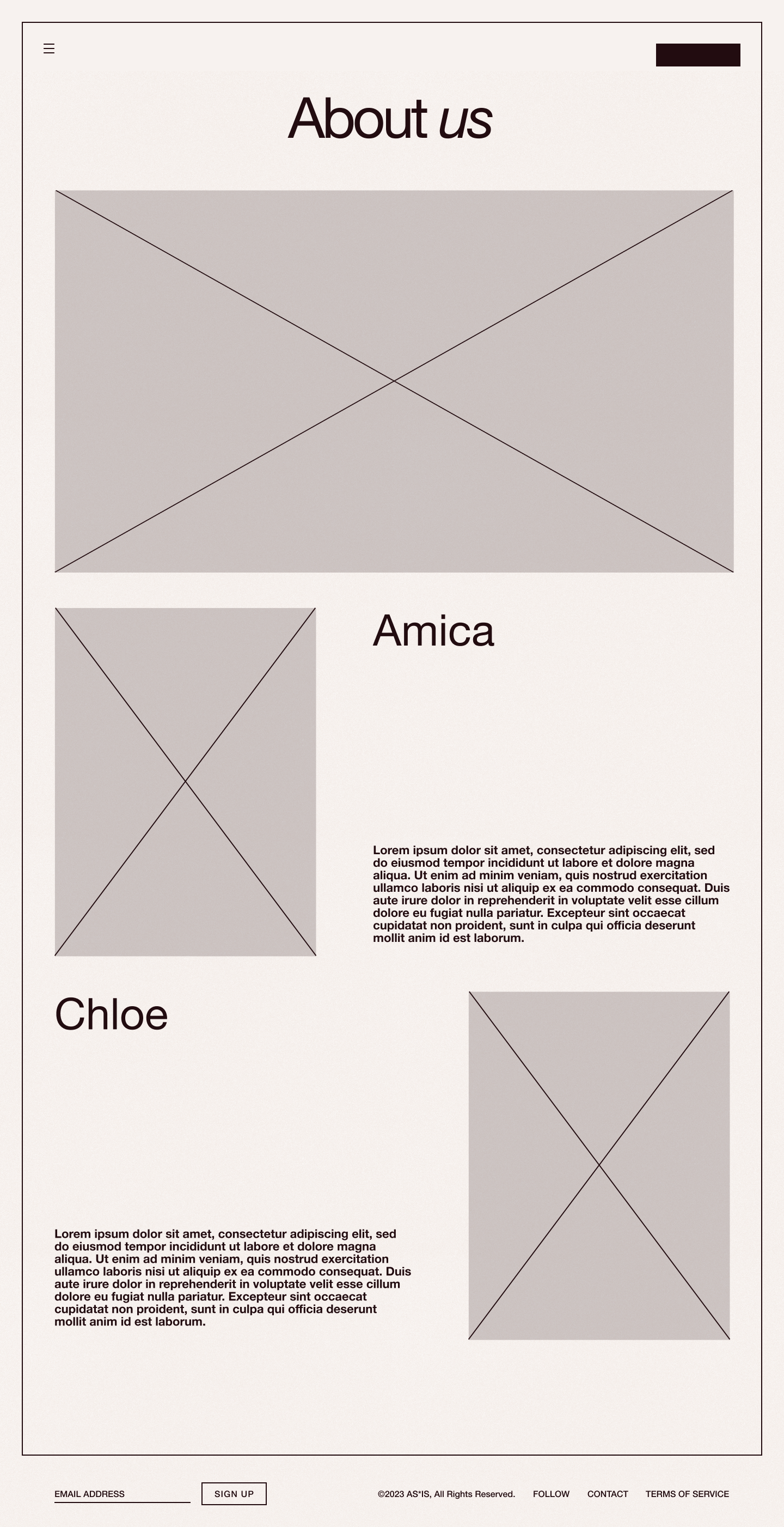
as*is film is a new company that offers film photography services. The co-founders, Amica Huynh and Chloe Kehn, were trying to break out into the Seattle scene with a website that could impress future-clients and introduce themselves to the scene.
Problem:
as*is did not have a website that could showcase their portfolio and act as their contact form. The company was in need of an all-encompassing tool to garner clients and establish rapport with the film community.
Goal:
I wanted to create a website design to showcase the company’s values while also finding a way to highlight their talent. Additionally, I wanted to communicate the company’s vibrancy and youth.
Team:
Isabelle Iwatsubo
Joel Ramos
Tool Used:
Figma
Timeline:
2 Weeks
Outcome:
Designed a complete brand identity and website for a new Seattle-based 35mm film photography company — from scratch in two weeks. Delivered a logo, full color system built around a signature Blood Orange palette, typography pairing, UI element library, portfolio gallery with detail pages, process page, persistent contact CTA, and marketing poster designs. Also designed responsive mobile layouts and motion guidelines. The live site is at asisfilm.com.

Mood Board
Sharp corners
Bright, warm-toned colors
Borders and frames
Clean and minimalist


Logo
as*is wanted a logo that was minimal and clean but felt connected to their brand. The company wanted something that felt timeless and classic that wasn’t drowned in flashy detractors. The company, at its essence, wants to emphasize the beauty in keeping things as we would naturally find them—by keeping them as is.
Color
The color palette centers itself around the vibrant Blood Orange color. The Marshmallow and Licorice colors are meant to help support the signature Blood Orange while not detracting from its value.
All secondary colors are reserved for marketing purposes. These colors can be used as accents in posters, thumbnails, and print materials to help support the vitality of the brand, but are not to be used for the functional website.
Typography
DM Serif Text is the same font used in the logo for as*is. A serif font felt the most appropriate for the sharp ends and antique-feeling you get from film photos. This font creates a vintage feeling to a modern project while maintaining a minimalism that doesn’t detract from the photos showcased.
The body font, Montserrat, adds a nice contrast to the sharpness of the header while still embodying the sharpness and cleanness that DM Serif Text possesses.
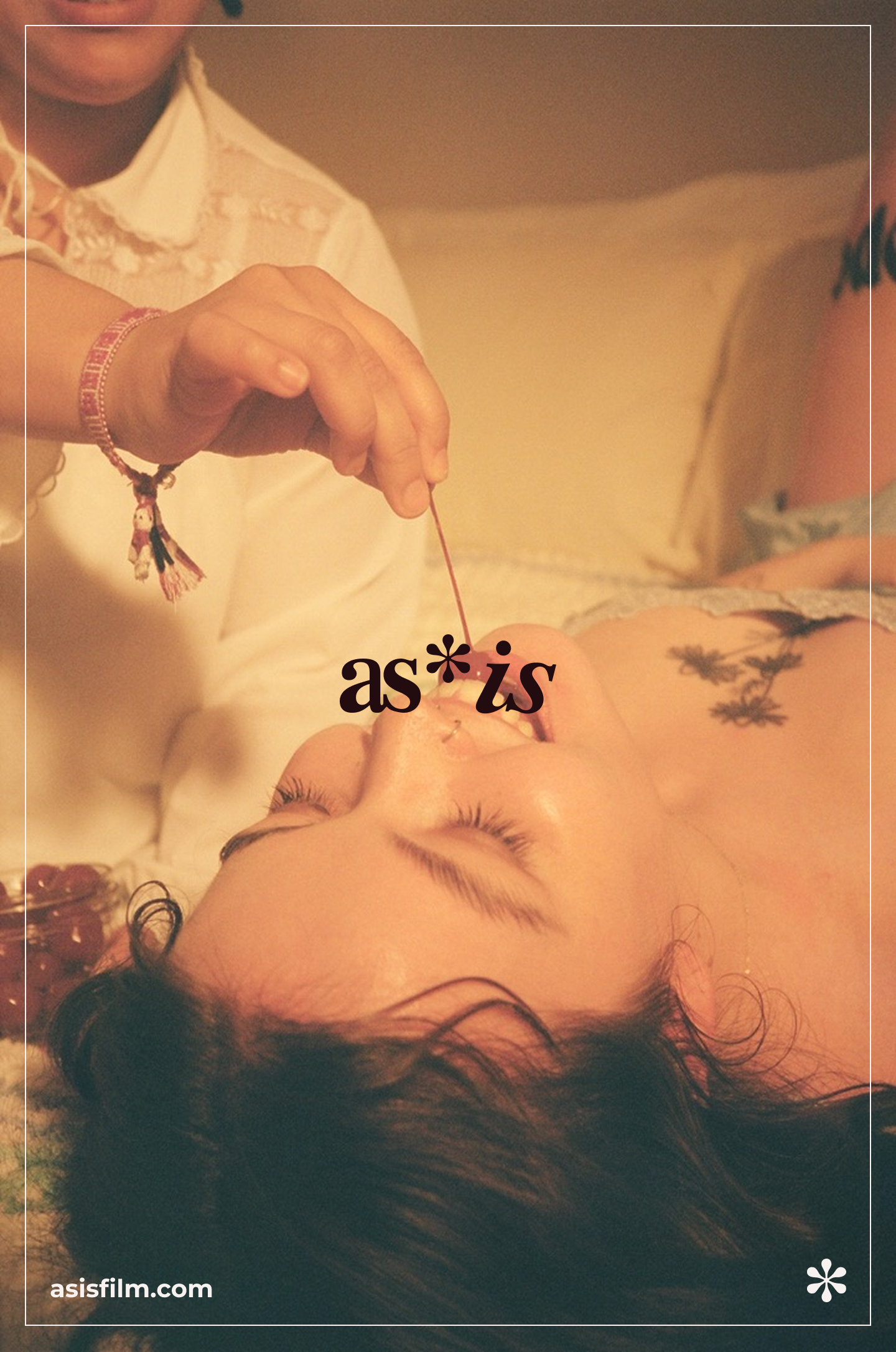
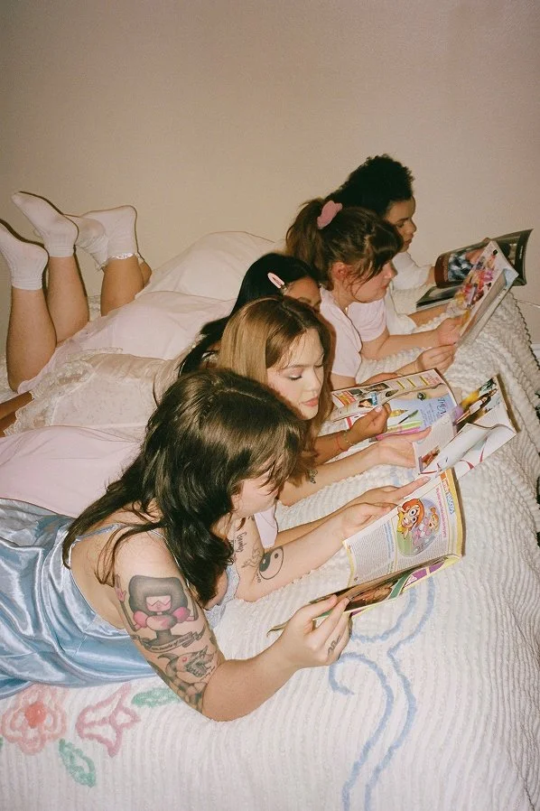
Imagery
The images show off warm colors while also harnessing the vibrancy and clarity that digital photos have. They present a modern feeling with hints of vintage themes. The imagery captures the company’s essence as a whole while also highlighting the beauty of stillness in film photos.


UI Elements
All UI Elements should maintain the sharp edges used elsewhere throughout the website. When strokes are used, they should emulate the same framed, border-like feel that is used to encapsulate the content and emphasize the elements.
Challenge ✹ Solution
No portfolio
Highlighted major works
Presented content efficiently
Enabled detail pages
no contact form
Created a contact section
Featured contact CTA always
Spotlighted social media
no rapport
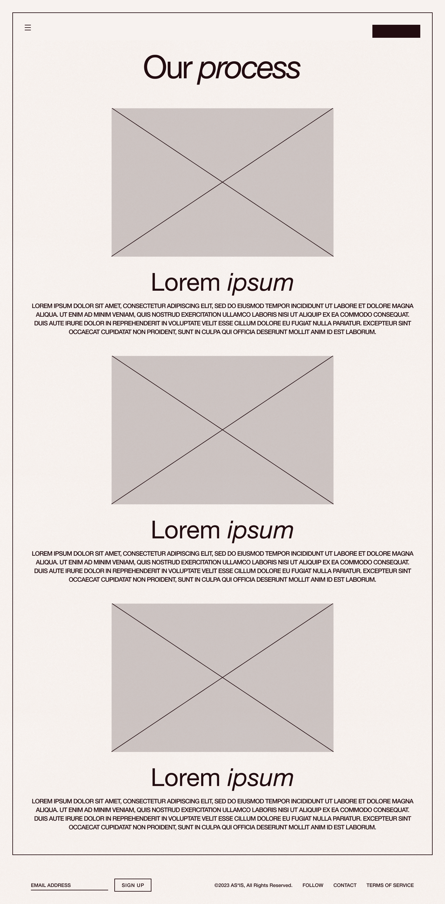
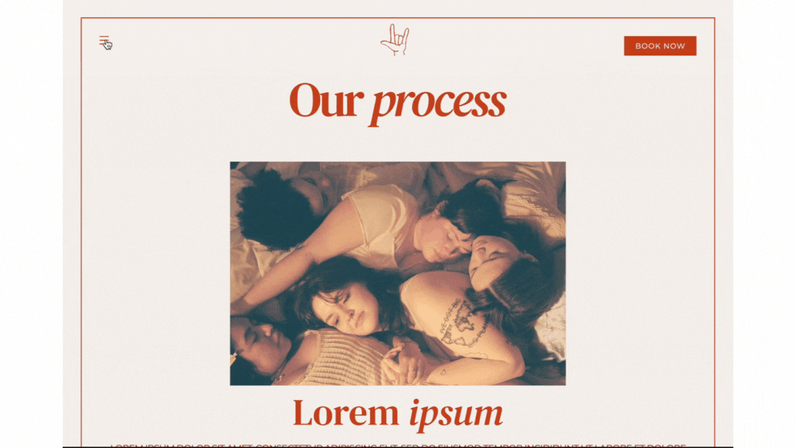
Showcased the film process
Added owner introduction
Let the work speak for itself
Design System
Showcasing company values
In this website design, I focused on building a narrative around the brand's commitment to analog photography, emphasizing the uniqueness of each shot and maintaining singular attention. Through behind-the-scenes insights and a page dedicated to the film-shoot process, I wanted to communicate how their deep respect for tradition and artistry sets them apart in a digital-first world.

highlighting talent
In this design process, I wanted to ensure that the website truly highlighted the exceptional talent of the co-founders. By showcasing their stunning images and thoughtful approach to photography, I aimed to emphasize their artistry and technical expertise. I wanted to make sure that the website was functional enough for the owners to be able to constantly update their portfolio in a sustainable way that held true to the essence of my designs.
vibrancy and youth
As a new company, it was important to emphasize the vitality of the service while never undermining the expertise of the photographers. Through dynamic imagery and a fresh, bold aesthetic, their portfolio reflects their passion for storytelling and contemplative process. This project emphasizes their youthful spirit while capturing the essence of what makes them stand out in the evolving landscape of film photography. A contact form is always easily accessible so no matter where you are on the website, you can always find a way to stay in touch.
Motion
enhancing Interaction
Easing should be quite quick and feel seamless in the user experience. The motion should never feel distracting; rather, the user should be drawn to motion only as a means of shifting their attention to a new focal point.
All motion should be accompanied by overlays to ensure that the user is predominantly looking at one thing at a time. It should remind users of where the came from, but never mislead users to where they should go next.
Mobile Design
cultivating an experience
The mobile layout should hold true to the previously established systems. Using frames, intuitive user paths, and a minimal design, the user should always feel like each section is distinctly separate and equally as important as the last.
Marketing