
CALIFORNIA TRANSIT ASSOCIATION
The California Transit Association promotes the betterment of transit-related matters. The brand opens the floor for more effective dialogue in respect to the needs of public transit through changing/implementing policies, establishing funding, and creating system infrastructure.

Service: Web Design
Overview:
The California Transit Association’s website is in need of a fresh look that users can operate more easily. The site should help communicate the brand’s values and mission while also promoting important information in a more effective manner.
Problem:
The California Transit Association’s website is not content-driven and does not reflect the brand and its current image. The website is cluttered and does not effectively communicate to users what information is important or not.'
Goal:
We wanted to create a website redesign for the brand that would revitalize the brand identity and organize information more effectively. Additionally, we hoped to design a more content-driven layout.
Tool Used:
Figma
Timeline:
4 Weeks
Team:
Yuya Oda
Isabelle Iwatsubo
Mood Board
Line separations
Modern + minimalistic layout
Static imagery
Neutral + monochromatic backgrounds
Spacious layout
Large imagery breaks


Color
The color palette centers itself around the California Blue and California Gold color. There is a sense of community that connects users with the color palette due to the historical significance to the state.
Ocean Foam and Sage are secondary colors that continue off of the California theme but don’t take attention away from the primary colors.
Typography
Proxima Nova is a classical sans serif font combining modernity with a geometric style. This sans serif creates a clean look without detracting from the information on the pages. This classic font is easy to read and makes the design more accessible and engaging for users.
Imagery
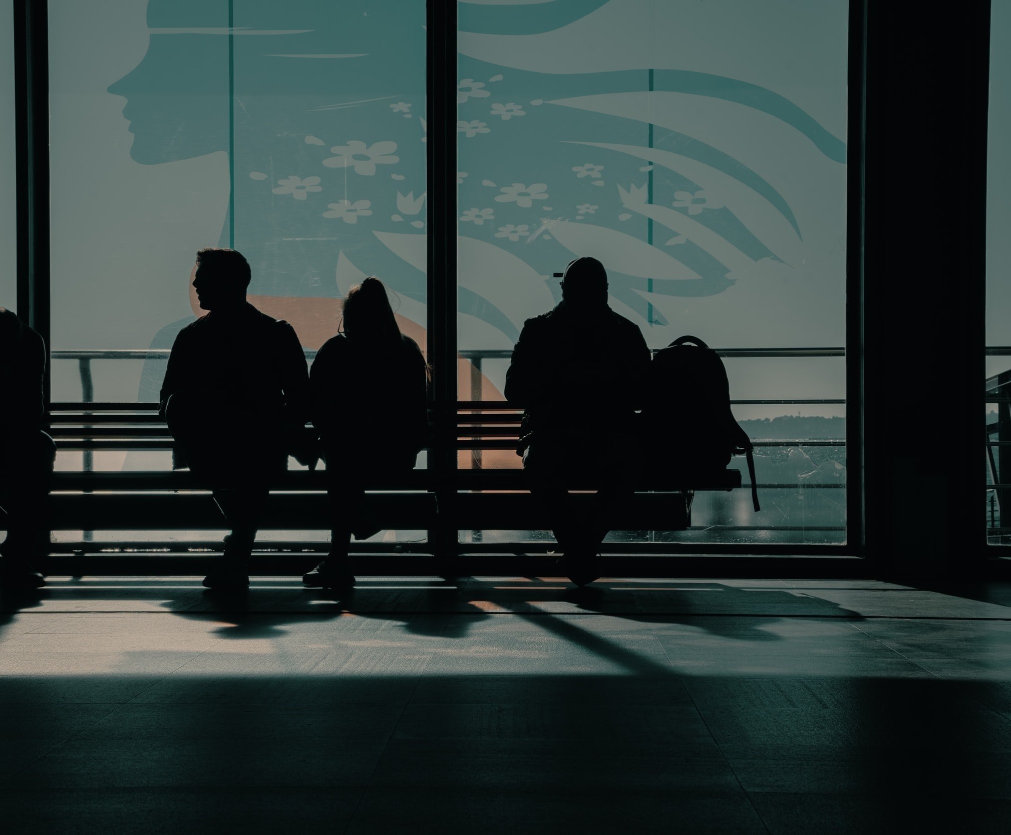
Images should adhere to warm-toned colors. Imagery should have a modern and clean look to them. Movement should be a central them in the images. The pictures should make transit services look inviting and peaceful.


UI Elements
All UI elements should maintain a sleek and inviting look with thin stroke weights and rounded corners. Primary buttons should be large so they are easily seen and can hold plenty of textual information. All elements should maintain a minimal style so users are not distracted from primary content.
Challenge ✹ Solution
Not content-driven
Improved site navigation
Re-organized content
Altered page layouts
Does not reflect the brand
Created a cohesive color theme
Added brand information
Fixed imagery to be more inviting
Cluttered
Removed unnecessary information
Fixed UI elements to be more consistent
Consolidated pages to folders
Design System
Taking users on a new ride
With the new design system, we were looking to enhance user experience by organizing information more effectively. The landing page now highlights important information for users and allows quick access to the most relevant resources from the brand.


Highlighting important content
A major goal of this project was to design a more content-driven layout. We differentiated ideas with clear and concise headlines. We also wanted to revitalize the California Transit Association’s brand identity. We did this by implementing a more consistent style across the website that is more easily identifiable.
Inviting users inside
While creating the design, we focused on improving information transparency and user comprehension. Pages were designed to present content in a more digestible way that users could better understand. Modules were also consolidated so users would not have to search throughout multiple pages to find related information.
Establishing a relationship with users
With this website redesign, we wanted to establish a more personal relationship between the brand and its community. Various pages are designed to give a closer look at important details regarding the California Transit Association.
Experience Design
Page filtration
To further the brand-client relationship, we designed a filtration system allowing users a chance to interact with information. This layout best utilizes page space by sorting most relevant items first.
Mobile Design

Making information easily accessible
To reduce the amount of clutter when converting to a mobile screen, page layouts were designed to synthesize information more efficiently. Rather than polluting pages with excessive information and links, components are easily accessible and navigation is condensed into a toolbar conveniently located in a sticky header.