
CELESTIAL CREATIONS
Celestial Creations is a retail brand that began in Las Vegas. After an influx in online small businesses during the pandemic, creator Jasmine Kemp decided to add a touch of magic to products that she personally loves.
Services: Logo Design, Ecommerce Web Design, & Packaging
Overview:
Despite its viral online presence, Celestial Creations’ analytics indicated a high bounce rate and few online sales. Celestial Creations recruited me to help create a design that would improve engagement and help establish the brand.
Problem:
Celestial Creation’s website is lacking substance and personality. The website has inconsistent imagery, has little content, and is too plain. Their current website does not reflect the fun vitality of the brand and falls short of content.
Goal:
My goal for Celestial Creations’ website was to create a website redesign for the small business that would increase site traffic and revenue and help establish a brand identity. I also hoped to convey the brand’s fun and modern take on its products. I wanted the logo design and packaging to encapsulate the brand’s identity.
Tool Used:
Figma
Timeline:
4 Weeks
Team:
Isabelle Iwatsubo

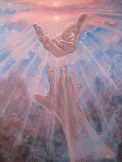
Mood Board
Ethereal + mystical imagery
Modern + minimalistic imagery
Purple hues
Natural elements
Open space
Elemental imagery


Logo
My logo design incorporates a sun and moon in order to convey the brand’s astrological connections. This also doubles as an abstract image of a third eye. The moon and its shadow create two letter C’s to represent Celestial Creations’ name abbreviated.
Color
The color palette is centered around the color lavender. This color is prominent in Celestial Creation’s products through gemstones, flowers, and wax coloring. This lavender color is meant to evoke a feeling of calmness in website visitors. The color is a lighter tint to bring a lightness to the color story.
Typography
The serif header font, Kaisei Decol, emulates the serif font often seen in tarot cards. This plays into the spirituality associated with Celestial Creations. The decorative quality of this type connects with the playfulness of the brand and brings life and personality to the website.
The sans serif body fonts compliment the sleek header styles while presenting a more modern and rounded look. This keeps with the minimalist quality of the brand and shows the sophistication of the products.
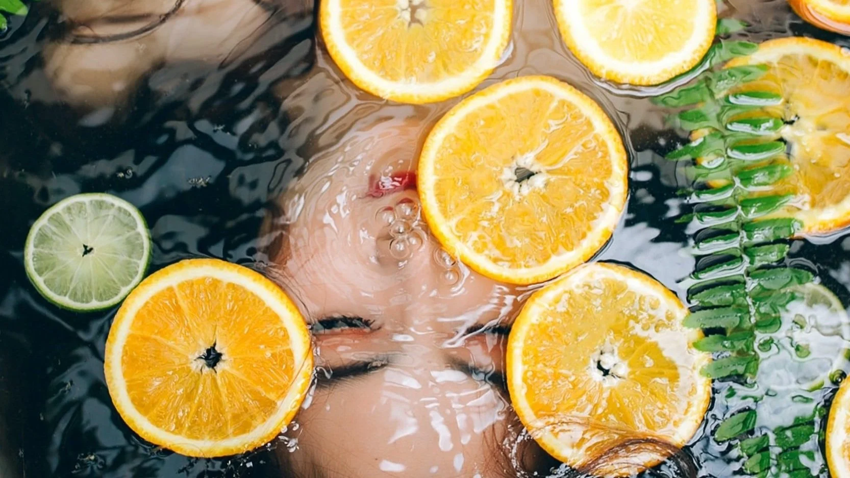
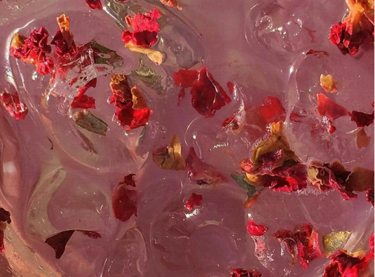
Imagery
All images should follow a warm color palette with an emphasis on nature, minimalism, and light. The imagery should give off a feeling of serenity and bliss.


UI Elements
UI elements should maintain the black and white minimalist style. Image elements should look detailed and hand-drawn in order to depict the shop’s attention to detail and hand-made quality. All vectors should have a thin stroke weight to convey a minimal and less cluttered look.
Challenge ✹ Solution
Inconsistent imagery
Improved product images
Established imagery style
Organized & categorized catalog
Little content
Created calls to action
Constructed UX systems
Added brand information
Plain
Updated brand image
Constructed marketing plan
Included lifestyle images
Design System
An invitation to explore
On Celestial Creations’ previous website, the pages only displayed the product catalog. I designed the new website in a way that would formulate an experience that was welcoming for users while also showcasing the product in various ways. I wanted the design to still be content-driven so new customers could easily explore all that the brand has to offer.
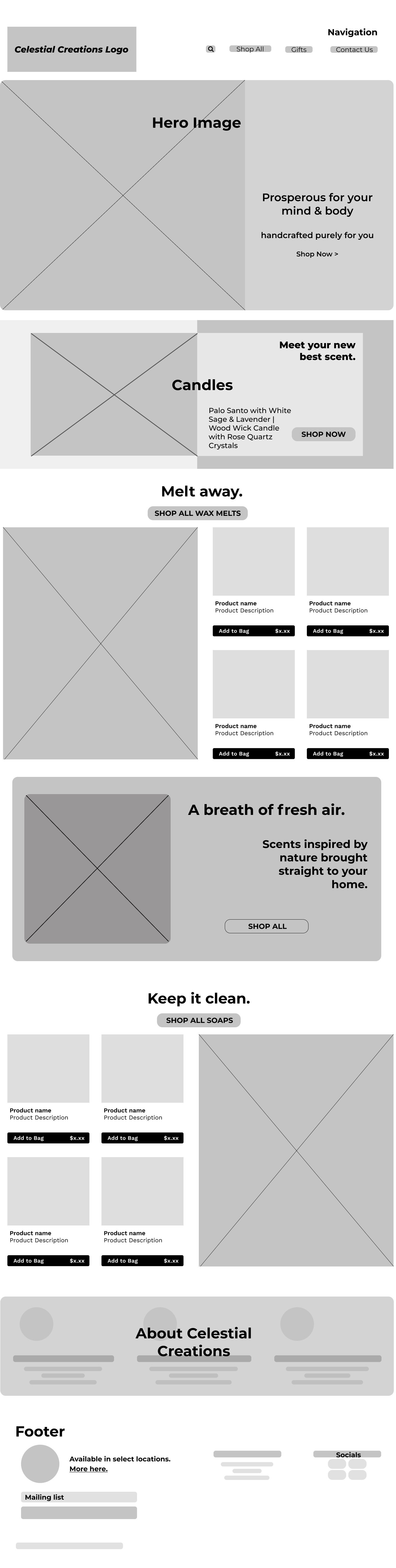

Establishing a brand image
Celestial Creations had yet to establish a definitive brand image. I wanted to help establish a brand identity that would institute a user base. I decided to market Celestial Creations as a brand that someone can implement into their daily routine. This creates recurrent value in the product. Another goal was to increase site traffic and revenue. I included lifestyle images so users can visualize the product in a scope that reaches outside of the webpage.
Bringing color to your life
I wanted to convey the brand’s fun and modern take on its products. In order to bring more vibrancy to the design, it was very important to showcase Celestial Creation’s products in a colorful way. Because the shop centers itself around a minimalist design, the colors seen throughout the website are meant to bring life and radiance in a way that symbolizes the brand’s vitality.

Experience Design
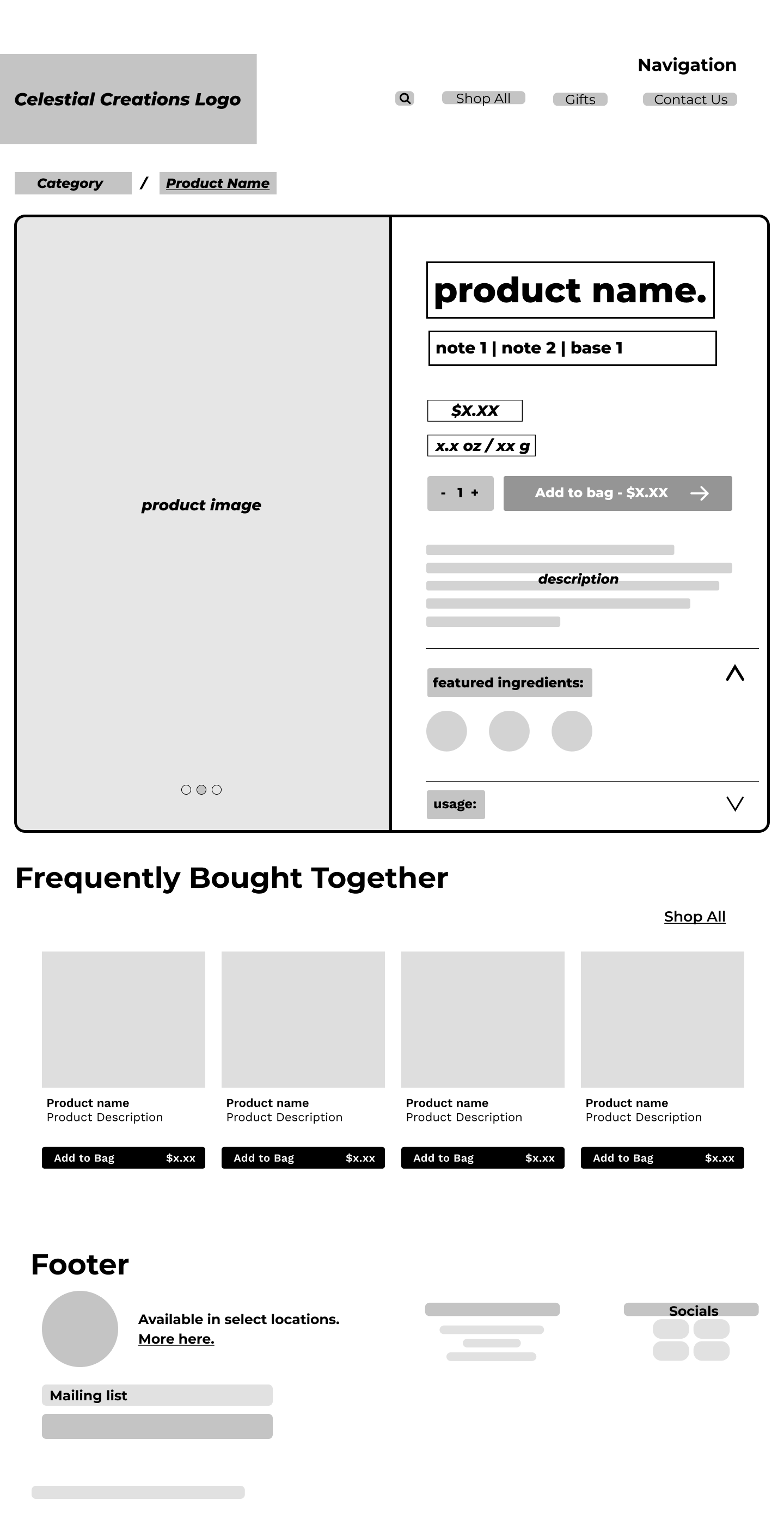
Product Categorization and Filtration
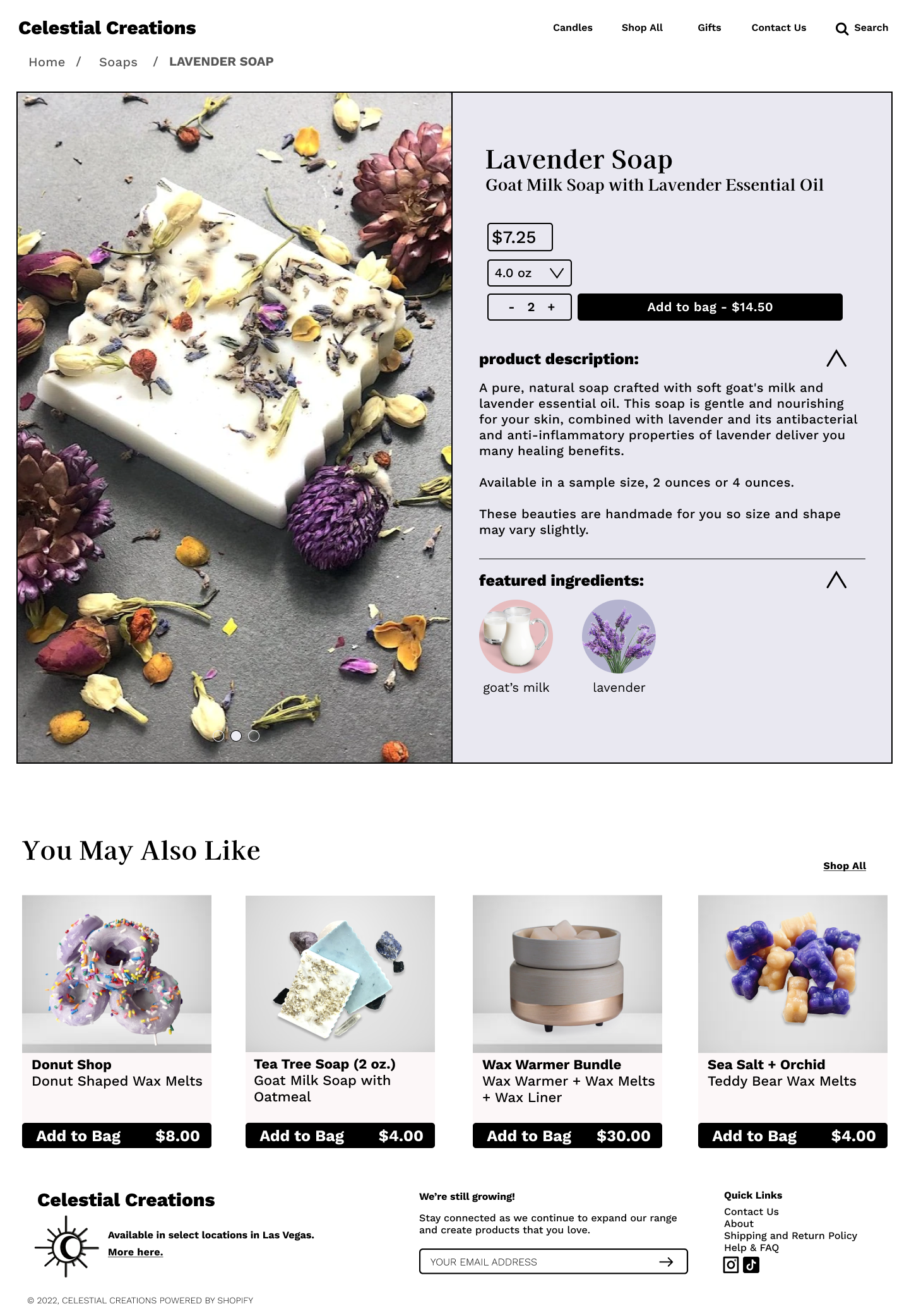
In Celestial Creations’ previous website, the product catalog was not categorized and was displayed without any organization. The new design filters the products in a way that divided them into three main categories. This separation presents users with a new shopping layout. The new design caters to various groups of people rather than lumping all users into one experience.
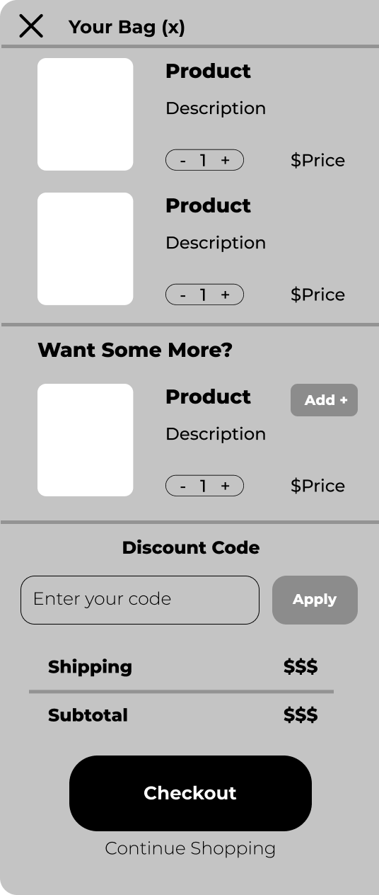
Pop-Up Cart
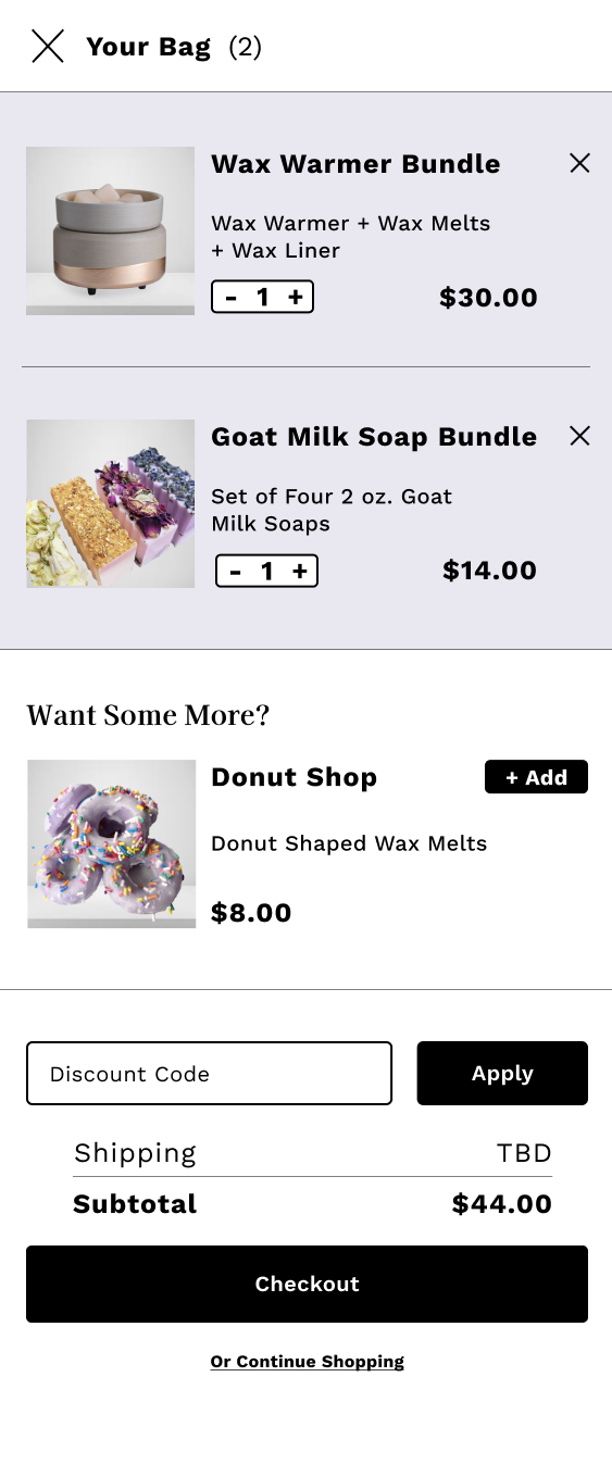
In order to enhance the e-commerce experience, I designed a pop-up cart feature allowing users to view the contents of their shopping cart without having to leave their page. By decreasing page navigation, users are less likely to jump from webpages. Additionally, the pop-up cart includes a suggested product section with a quick add option. This allows users more exposure to products without even having to leave the page. The convenience of a quick add promotes more products for users to be able to explore.
Mobile Design
Sticking to the Basics - A Minimalistic Mobile Shopping Experience
I decided to create a mobile design that centers itself around the e-commerce experience rather than cluttering the space with unnecessary information. The design is content-driven and integrates a simple user experience. Rather than having flashy graphics and endless motion, the design allows users to quickly and efficiently browse the catalog of products without interruption.
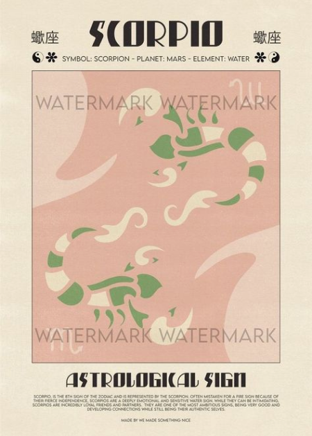
Packaging
A Mystical Spin on Card Inserts
Celestial Creations was looking for a card insert to promote the shop. I created a design that could stand alone while also connecting to the brand’s identity. The design emulates the look of a tarot card. This is consistent with the astrological theme while also showcasing the sun and moon imagery seen in the logo design.