
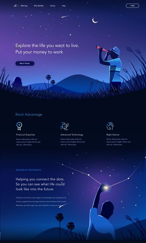
Microsoft marketplace
Microsoft’s Azure Marketplace offers thousands of industry-leading apps and services—all certified and optimized to run on Azure—perfect for others to find, try, buy, and deploy the solutions that they need quickly and confidently.

Service: Web Design
Overview:
Microsoft Marketplace wanted to revamp their website to showcase it as a viable resource across technological needs. The brand wanted the website to act as a shopping center for users looking to upgrade their products.
Problem:
Microsoft Marketplace’s interface felt dull, overly saturated, and inefficient. The site did not create a cohesive shopping experience for users and displayed information in a sterile and de-personalized way.
Goal:
We wanted to create a website redesign for the brand that would optimize the space as a shopping center for users and create a gallery of products that felt intentional and informative during the shopping experience. Additionally, we hoped to showcase the apps’ features in a way that didn’t feel overwhelming to users.
Tool Used:
Figma
Timeline:
4 Months
Team:
Chang Baek
Courtney Colwell
Christopher Follett
Chris Galvin
Oli Geal
Jean He
Ryan Huber
Isabelle Iwatsubo
Jafar Khorshidi
Yuya Oda
Franco Ruarte
Tito Texidor

Mood Board
Blue color scheme
Minimalistic layout
Futuristic feeling
Clear headlines and modules
Technologically-focused visuals


Color
The color palette centers itself around various shades of Microsoft’s iconic core blue color scheme.
Typography
Segoe UI is a clean, and minimalistic font that is easily read and maintains the sophistication of the brand and information itself.
Imagery
All images should be pulled from Microsoft’s brand design photography. Images should all follow Microsoft’s technological theme and/or express the warm and friendly feeling that comes from shopping with the brand.


UI Elements
All UI elements should follow Microsoft’s brand design. Buttons should maintain extremely rounded corners. All elements should appear soft and minimalistic to adhere to the brand image.
Challenge ✹ Solution
Dull
Added striking visuals and motion graphics
Created an interactive experience design
Revitalized information in beautiful formatting
Overly saturated
Removed irrelevant information
Categorized information into specific categories
Created various sizing options for layouts
Inefficient
Prioritized products and galleries of content
Re-organized layouts with related information
Condensed excess information into tabs
Design System
The premier destination for all your software needs
With the new design layout, we wanted to highlight the brand in a way that felt powerful and innovative. We wanted to make sure that we displayed each product in a way that felt like a fun and interactive shopping experience to all users.


Buy and deploy seamlessly
In the new design system, we were looking to enhance user experience by optimizing the space as a shopping center for users. The different modules on the landing page leads users across various categories of softwares and applications in order to best cater to users’ needs while also introducing them to new content that feels relevant.
Find and try confidently
With this website redesign, we wanted the shopping experience to feel intentional and informative. The three varying sizes we designed for the gallery pages display detailed looks at categories, a large shopping ground, related content, and popular products.


Drive innovation for existing and future apps
While creating the design, we wanted to display information on the PDPs in such a way that is minimalist and efficient while also showcasing the app’s features. We created different sizing options that varied in graphics, information, and related shopping content.


Experience Design
Categories Expansions
We designed a category expansion system that would allow users to personalize their experience by interacting with the content that best fits their needs while hiding information in a way that doesn’t minimize it.
Tabs
We designed a tab system that would best utilize space on the PDPs by categorizing content in such a way that users can easily find out more information with less scrolling.
Hover
In order to make the most use of the space, we created a hover system on product cards for users to be able to interact with a product without having to navigate to another page.
Product Filtration
To further the personalization of the user’s experience, we designed a product filtration system that would allow users to easily find what apps and softwares are most applicable to their own needs.
Mobile Design

cross-platform mobile experiences
In order to preserve the integrity of the desktop sites, we created mobile screens that allow easy access across categories of information in order to make the Azure shopping experience feel personalized and efficient.