
POPPED
Popped is a popular gourmet popcorn shop aiming to give customers tasty treats ranging from cult classics to unique flavor combinations. Founded in 2011, Popped carefully curates flavors to create a unique food experience that can be enjoyed in the comfort of your own home.

Service: Ecommerce Web Design & Logo Design
Overview:
After the pandemic severely reduced in-person clientele, Popped discovered the power of a strong online presence and the impact of their website on customers outside of the Las Vegas metropolitan area. Popped is looking to give their website a fresh, new look in light of the surge in e-commerce sites.
Problem:
Popped’s website was hard to navigate, cluttered, and appeared outdated. The product was not the focal point of the landing page and the relevant information was buried.
Goal:
I wanted to create a website redesign to improve user experience as a whole and also improve keyword searches. Additionally, I wanted to communicate the brand’s playfulness, vibrancy, and youth.
Tool Used:
Figma
Timeline:
4 Weeks
Team:
Isabelle Iwatsubo

Mood Board
Rounded corners
Bright, warm-toned colors
Retro fonts
‘70s styles


Logo
Popped’s original logo contains their iconic chef’s hat in place of the letter ‘O’ in their name. The original logo uses the brand’s signature hot pink and dark brown color combination.
Popped’s Old Logo
The logo redesign maintains the integrity of the original design while adapting an overall softer look in the website redesign. The color is now more visually appealing as reflected in an updated brick color. The redesign is consistent with the adjusted brand image which emphasizes a more youthful and inviting style. This change targets a wider demographic and is also better adapted for scaling.
Popped’s' Logo Redesigned
Color
The original main colors were vibrant but off-putting. These colors weren’t connecting with the user base and failed to communicate the brand’s vitality.
Original Colors
The adjusted colors maintain the pink scheme but are muted thus making the colors more palatable. The new colors provide an inviting warmth and pays homage to retro styles to create a fun and exciting look. The secondary colors stay within the same tint as the primary colors without detracting attention from the focal colors.
Adjusted Colors
Typography
The headers’ font (Coiny) has rounded corners and a bubbly feeling. This font creates a bouncy look and gives a modern spin to the retro theme. This decorative typeface offers a fun impression on the brand as a whole. This font gives a more playful impression on visitors and connects to the new brand image.
Its counterpart (Poppins) maintains the rounded look while offering a clean and easy-to-read style. This geometric sans serif creates a break between the bulkier headers. This font gives the new website a more polished look than the original website’s more crowded decorative font.
Imagery
The images show off retro, warm colors while also displaying clean lines and rounded shapes. They present a modern feeling with hints of vintage themes. The imagery is playful and fun to increase engagement with the product. The photos depicts the communal aspect of the product in order to show a wider appeal to groups.


UI Elements
All UI Elements should follow themes including: rounded corners, thin strokes, and the colors in the adjusted color strategy. This combination maintains the minimalist theme throughout the redesign and helps to simplify the website.
Icons should have a hand-drawn style to them in order to depict the brand’s handcrafted items. This reminds users of the artisanal quality of the product while also showcasing the brand’s playful style.
Challenge ✹ Solution
Hard to navigate
Improved keyword search system
Condensed navigation bar
Implemented product filter system
Cluttered
Eliminated unnecessary graphics
Reduced decorative sections
Organized product catalog
Outdated
Changed harsh colors and fonts
Added interactive UX systems
Updated brand image
Design System
Call to action
In its original design, Popped’s website was not content-driven. The landing page wasn’t communicating to users what information was important or not. The redesigned landing page shifts the focus to the product itself. I was able to market the product in a way that would encourage further exploration across the website as a whole.


Refining the brand image
When taking a look at Popped’s previous website analytics, there appears to be a high bounce rate where most users leave after browsing the landing page. There was a large focus on social media marketing in order to expand their user demographics. I altered the brand’s image to be more inviting to a younger audience without polluting pages with social media promotions.
Combining modernity with efficiency
Two major goals for this project were to improve user experience as a whole and also communicate the brand’s playfulness, vibrancy, and youth. I created a design to better utilize space on the website but also appeal to a younger demographic through a more modern style.
Experience Design
Two-Option Selection
Popped’s flavors are categorically divided based on two categories: Basic and Boujee. Previously, there was no explicit distinction between how these categories differed. I created a UX system that would define these categories while also enticing users to further explore the products and stay on the website for longer.
Hover
This hover tool allows for users to clearly see and interact with the product so that they feel like they are personally making their selection.
Product Filtration
I added a filtration tool that could allow users to sort through the various products without having to scroll through the extensive catalog. This optimizes spaces and allows users an overview of all the possible product options. The design also simplifies the website as a whole by condensing pages from the main navigation onto one page that displays all products in the catalog.

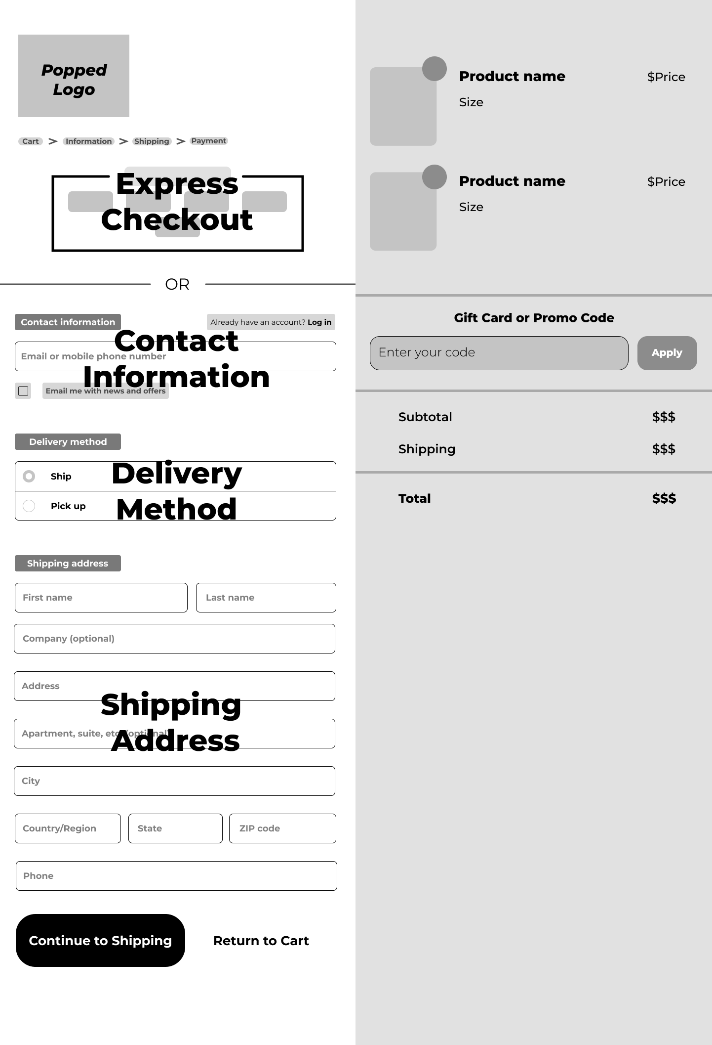
Pop-Up Cart
Previously, Popped’s website had a separate page that would redirect users to their cart. I designed a system that would allow for a pop-up cart to appear on the screen when selecting the cart icon. This minimizes confusion when shopping while also preventing users from leaving the main site prematurely.

Delivery Toggle
On Popped’s original website, there were two different pages devoted to Delivery and Pickup methods. These separate pages shared identical product catalogs with different prices. This resulted in duplicate results during keyword searches. With this UX system, the two pages are condensed into one product page. This not only improves the site navigation and layout, but also improves key word searches.
Mobile Design
Elevated Mobile Shopping
My goal with the mobile design was to emulate food delivery apps. The improved interface is adapted to mobile in a way that is simple to navigate and allows users spend less time looking for information and more time shopping.