
Salesforce
Salesforce makes cloud-based software designed to help businesses connect to their customers in a whole new way, so they can find more prospects, close more deals, and wow customers with amazing service.

Service: Platform Design
OVERVIEW:
Salesforce prides itself in being able to develop the technology, the partnerships, and the communities that help companies connect with customers. The company was looking for the best way to give their customers the software they need.
PROBLEM:
Salesforce’s interface was not unified and was polluted with content and information. Additionally, Salesforce felt disconnected from users as they were interacting with material.
GOAL:
We wanted to create a platform redesign for the brand that would further the brand-client relationship and create a more personalized experience for users as they navigate all that the platform has to offer. Additionally, we hoped to optimize product information so that users were able to get the most out of their experience and create to their highest potential.
TOOL USED:
Figma
TIMELINE:
2 Years
Team:
Stephen Aris
Guilherme Campos
Catriona Lohan-Conway
Scott Corrigan
Mark Edwards
Isabelle Iwatsubo
Adam Jennings
Amy Khan
Yuya Oda
Isabelle Pearce
Alex Poole
Tito Texidor

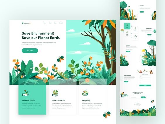
Mood Board
Nature images
Character elements
Text and graphic separations
Colorful and vibrant
Compelling story-telling


Color
The color palette centers itself around a blue family of colors reserved for more branded elements (Ex. Brand Logo, Display Type, CTAs).
Grayscale (and white) family of colors reserved for more subtle elements (ex. Body Typography, Dividers).
All color families are specific to a product focus area (ex. Sales, Industries, etc).
Typography
Display styles use the Avant Garde For Salesforce font in Demi weight and are reserved for headlines and subheadlines. Display styles introduce a page, a page section, or page subsection.
Body styles use the Salesforce Sans font family in regular weight and reserved for general body copy typography and inline links.
Imagery
Images should adhere to the brand’s four design pillars: (1) Create a sense of depth, (2) Keep it focused, (3) Make it move, and (4) Make it vibrant.
Visual elements within a composition should feel evenly distributed. The new brand expression lends itself to an asymmetrical balance that creates more visual interest.


UI Elements
All UI elements should follow a hierarchy (establish importance among visual elements, treating one or two as the main focus with smaller touches of secondary and tertiary elements) while maintaining simplicity (keep landscapes, vignettes, secondary and tertiary shapes, and overall compositions simple. Exercise restraint when putting all of the elements together, making sure that the total package is easy to understand).
All icons used represent general features, functionality, or content. Branded symbols are used to represent specific products.

Challenge ✹ Solution
Not unified
Standardized design styles and hierarchies
Improved content organization and display
Assembled an atomic structure as our strategy
Polluted
Eliminated unnecessary graphics and text
Consolidated information into appropriate spaces
Categorized content into designated areas
Disconnected from users
Personalized homepages and analytic screens
Increased interactivity in user interface
Offered content based off related interests
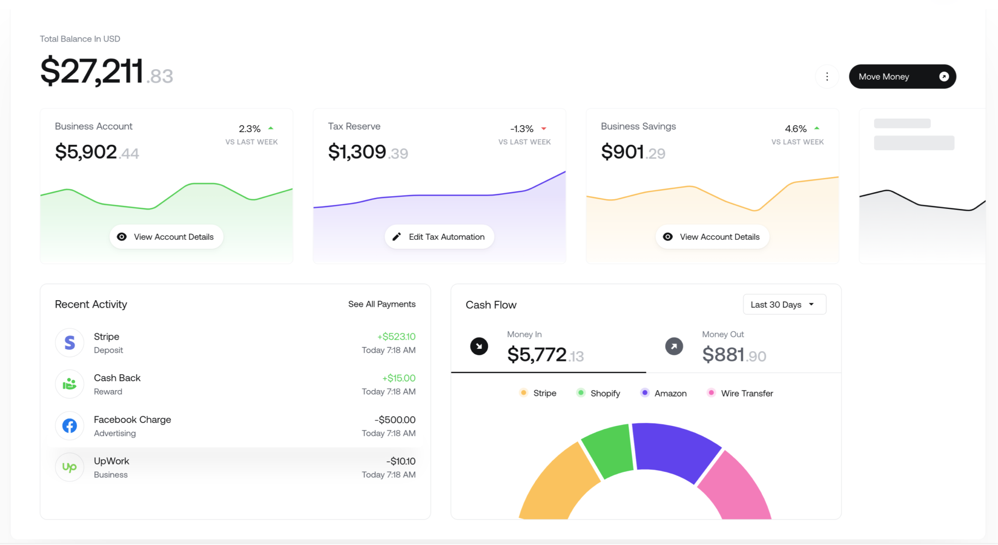
Design System
Customer focused
With the new design layout, we wanted to ensure that the most relevant information was presented to users first in order to customize their experience and to optimize their time while browsing.


building bridges between companies and customers
In the new design system, we wanted to further the brand-client relationship by integrating inspiring success stories from the company along with offering new methods of growth for users to be able to embark on.
Cultivating trust
While creating the design, we focused on optimizing product information by offering various avenues of content that are Salesforce-related. Whether it was through events that users could participate in or resources that could boost productivity, we wanted to ensure to give a spotlight to the products that make up the company.


Innovate together
With this website redesign, we wanted to create a more personalized experience for users by customizing their dashboards to include content most pertinent to their business. Through basic questionnaires, we are able to gain insight on each and every user to target them with resources and information best suited for their needs.


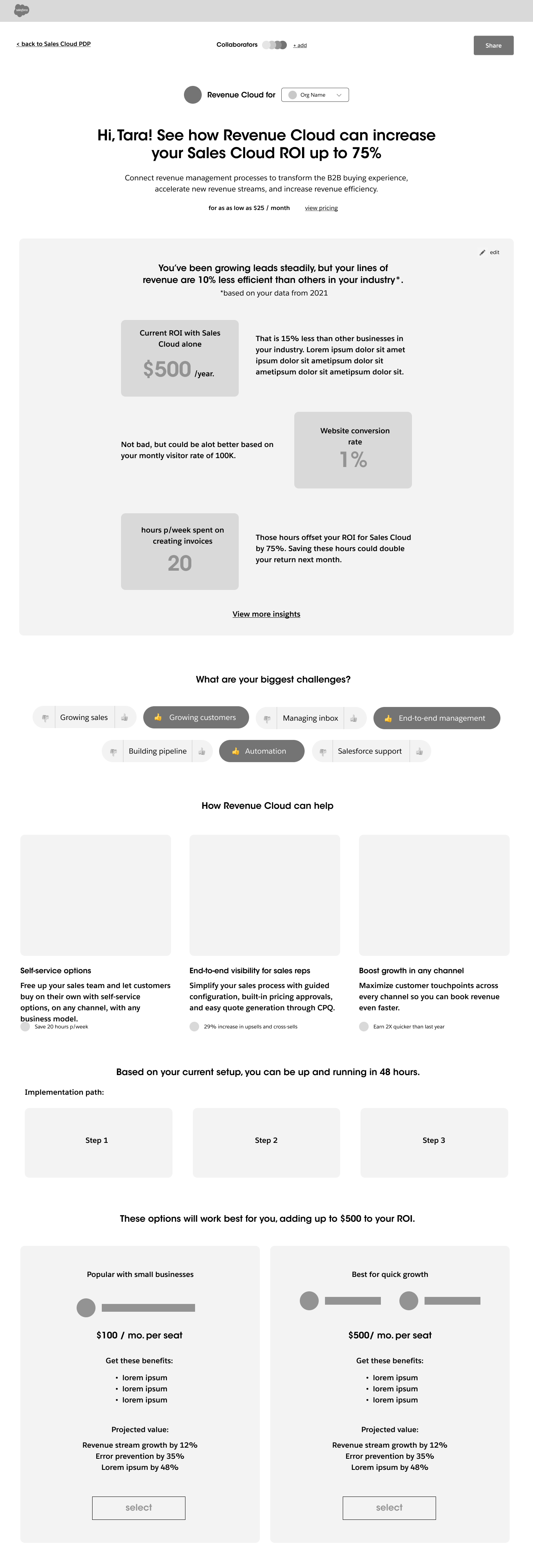
Experience Design
Region Selector
To increase the personalization of the user’s experience, we included a region selector that would allow for a seamless integration into multiple languages. That way, no matter what, users are able to get the most out of their time on the site.

Package Selection
In order to form a stronger connection with users, we wanted to increase the amount of interactive elements in the experience design. We were able to achieve even on a smaller scale by adding in little elements that made the site experience more dependent on users.
Mobile Design

The cUstomer Company
In order to make the mobile and desktop sites feel cohesive and unified, we created a design system that would easily alter between Desktop, Tablet, and Mobile formatting. This ensures that all layouts can tell the same story across interfaces.