Vimeo
Vimeo is a start-to-finish video platform giving creative professionals, businesses and organizations everything they need to make and market amazing, impactful videos. Vimeo prides itself as the world's the leading all-in-one video solution for users.
Service: Platform Redesign

Overview:
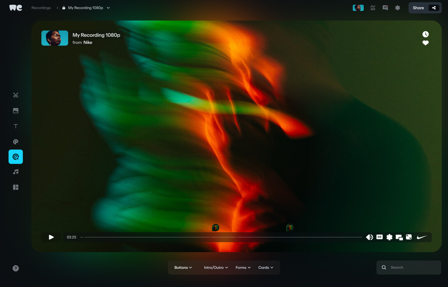
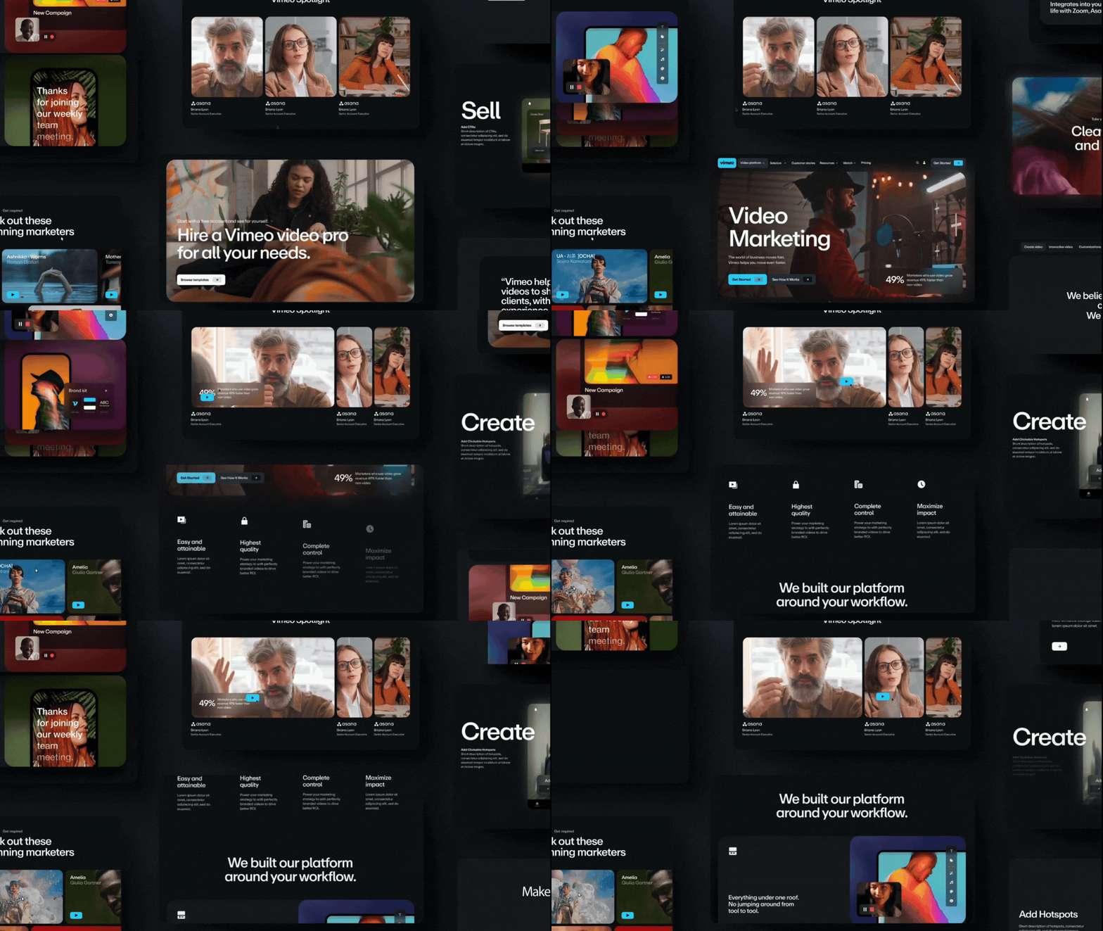
Vimeo was looking for a new design for their website to freshen up the look and feel of their interface. In a market oversaturated with video streaming solutions, they needed a way to stand out to users as a well-rounded platform equipped to meet any and all video-related needs.
Problem:
Vimeo’s interface was not intutive and lacked confidence. Additionally, Vimeo was inefficient for users to find relevant/important information and tools necessary for their needs.
Goal:
We wanted to create a platform redesign for the brand that would honor the core values to create focus, stay fearless, drive progress, and be immersive by creating a better workflow and overall user experience.
Tool Used:
Figma
Timeline:
3 Months
Team:
Gabby Clark
Yuya Oda
Isabelle Iwatsubo


Mood Board
16:9 aspect ratios
Cohesive, simple, and bold system
Warm colors and snappy motion
Approachable


Color
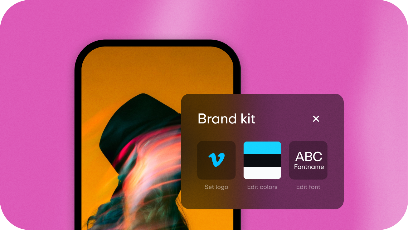
The color palette centers itself around the famous Vimeo blue color. The Vimeo blue is reminiscent of the core brand color previously used but brightened and refreshed for an updated look.
All secondary colors exhibit high contrast against the Vimeo blue in various shades used for accessibility and accents. Our accent palette provides a greater range of color options to use when showcasing the Vimeo product.


Typography
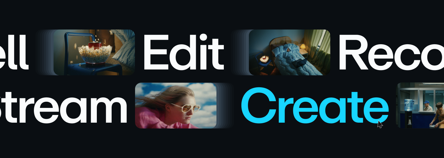
ABC Repro is a Sans Serif font which gives more personality and more rounded letterforms to Vimeo’s bold redesign. This font creates focus through simple bold headlines, clear visual hierarchy, singular bold visuals, scale, contrast and framing techniques. It is a flexible and straight-forward font that feels friendly but never talks over the content it’s paired with.


Imagery
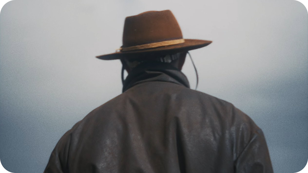
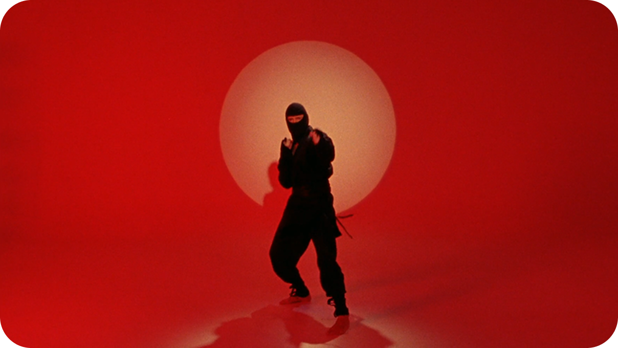
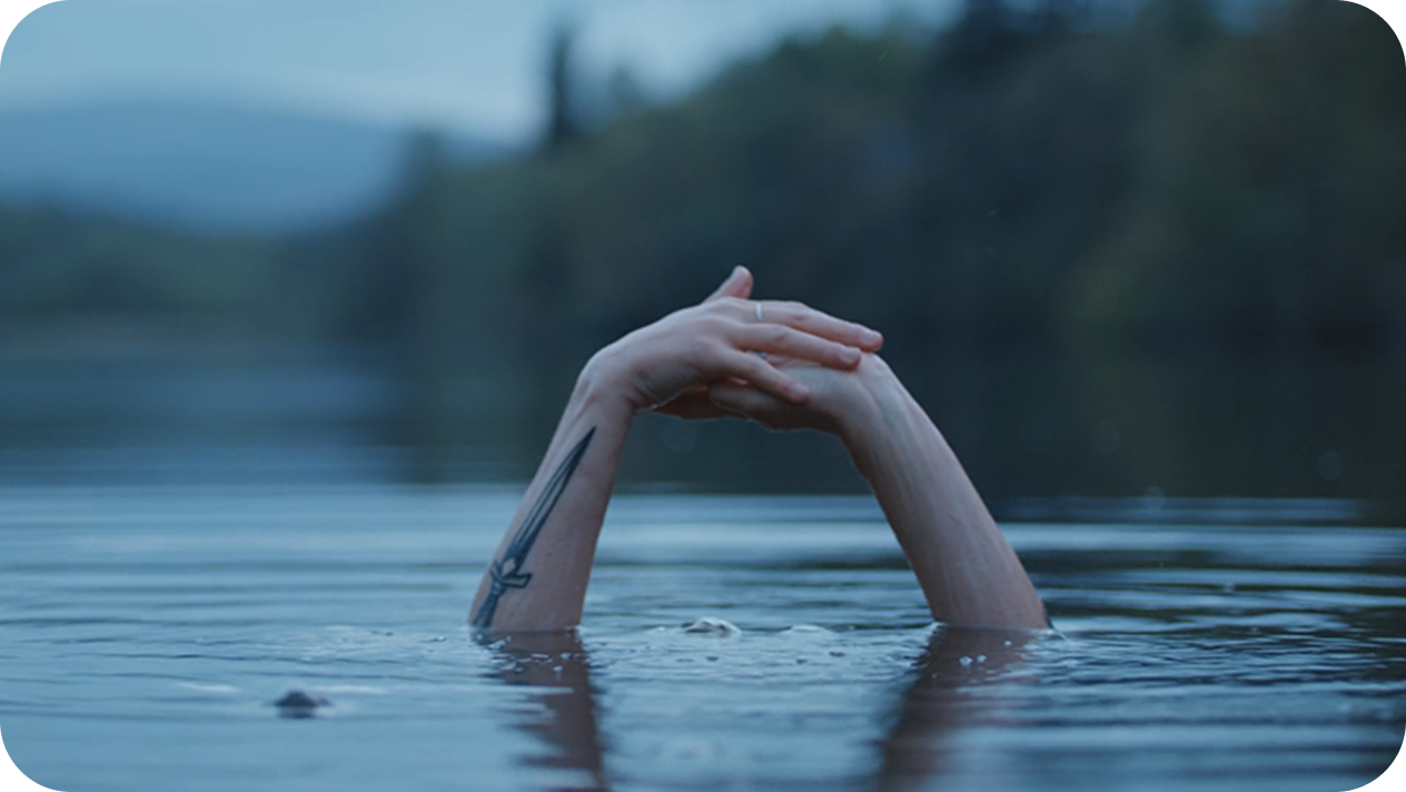
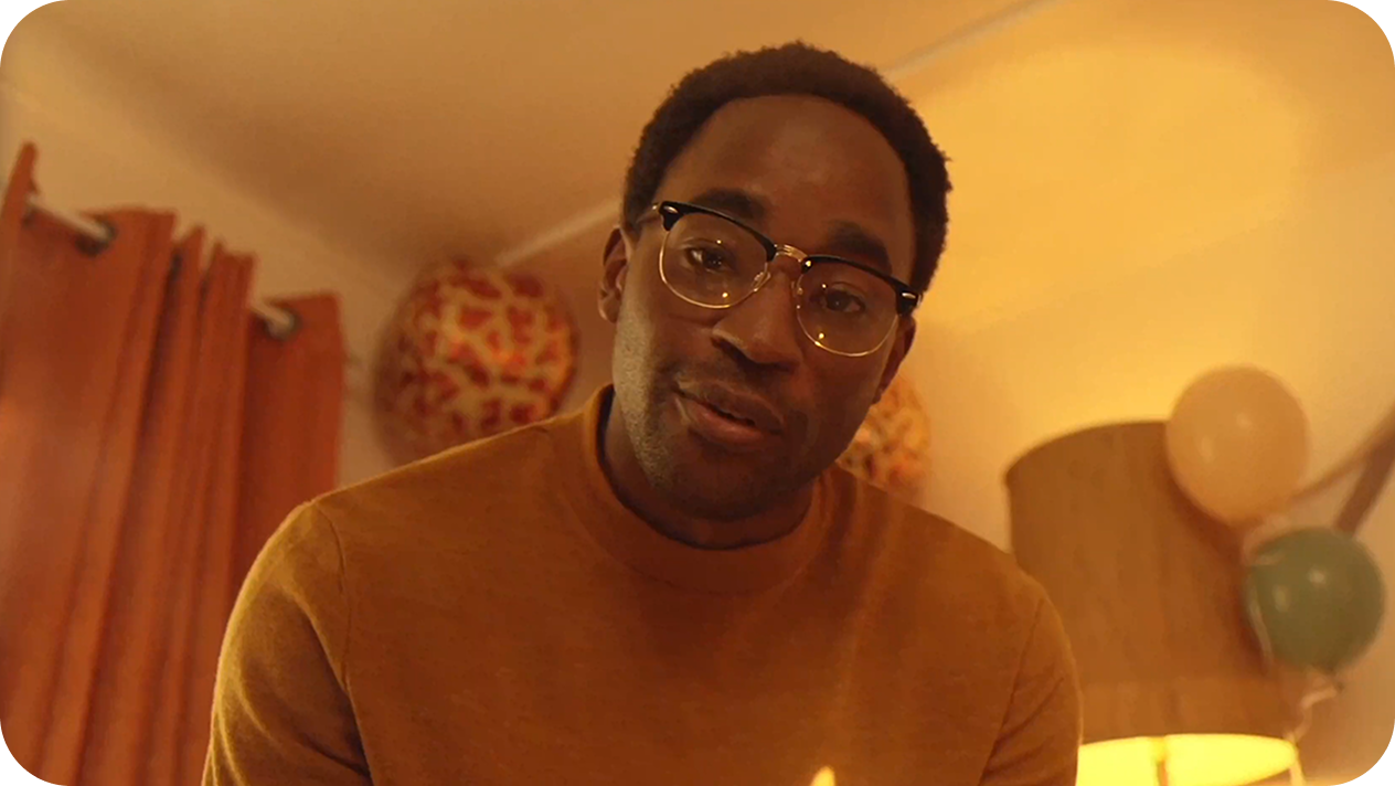
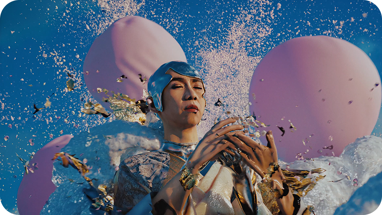
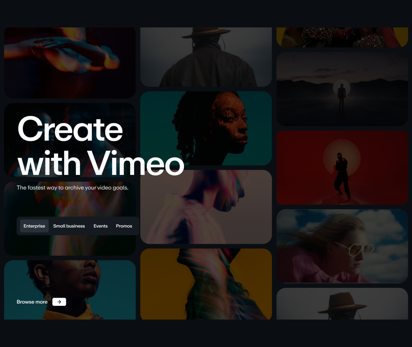
Images should emphasize motion, projection lights, film grain, and other visual effects that we recognize so often in video. There should be a mixture of clarity and abstraction, of scale, and interesting image crops. The photography should feel filmic, use warm tones, and show movement where applicable. The images used should capture the spirit of film and show a range of job types - from a creative professional to a CEO.

Logo
When we think about Vimeo, we think about that famous blue button, the one that sits in the bottom right of every player. It’s inherent to the visual language of video and Vimeo as a brand. We took one of our many modernized Vimeo logos and combined it with the form of the iconic blue play button. This new container also allows us to retain our previously liked portals concept, but now grounds in in a more relevant logic

UI Elements
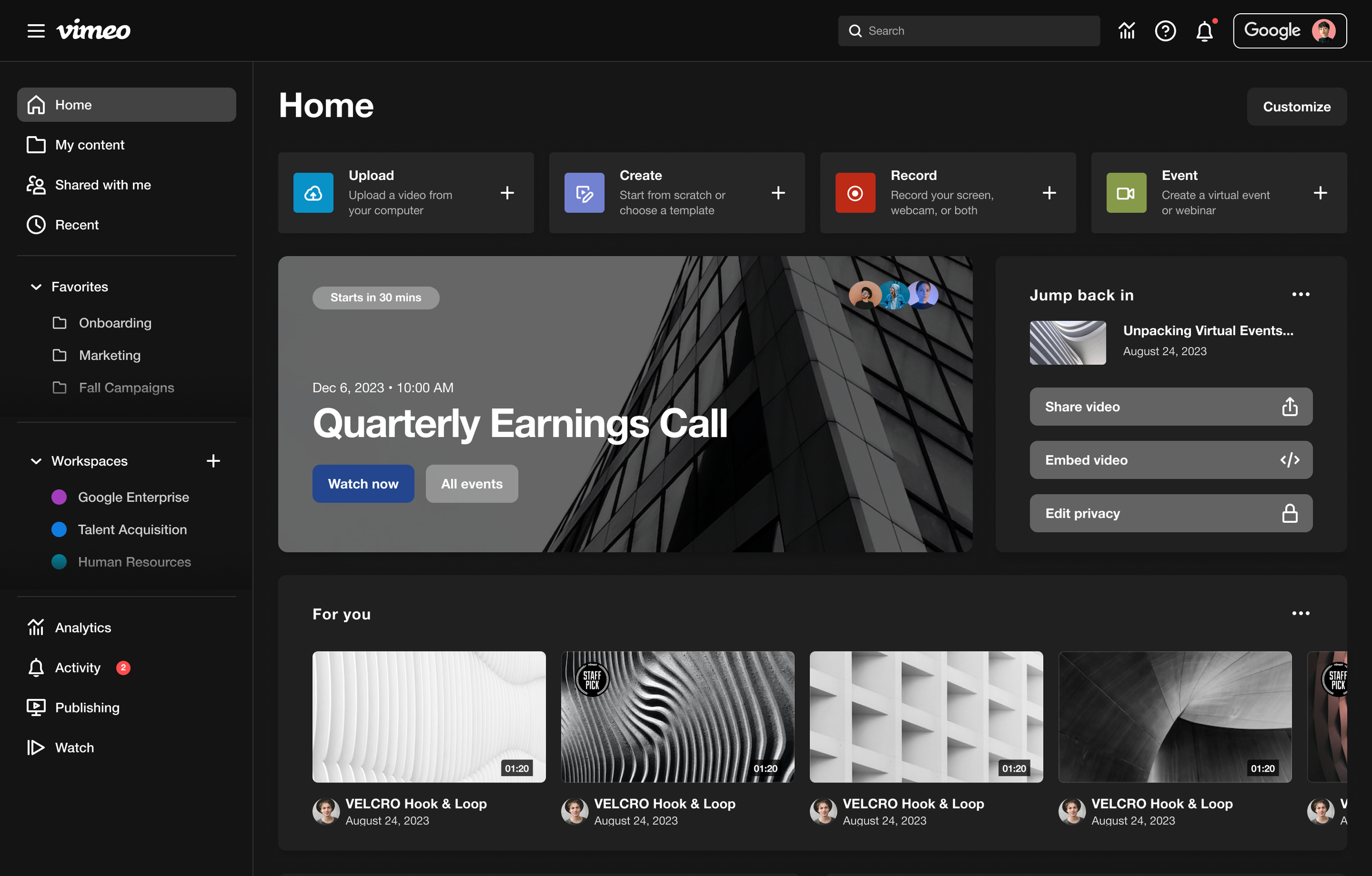
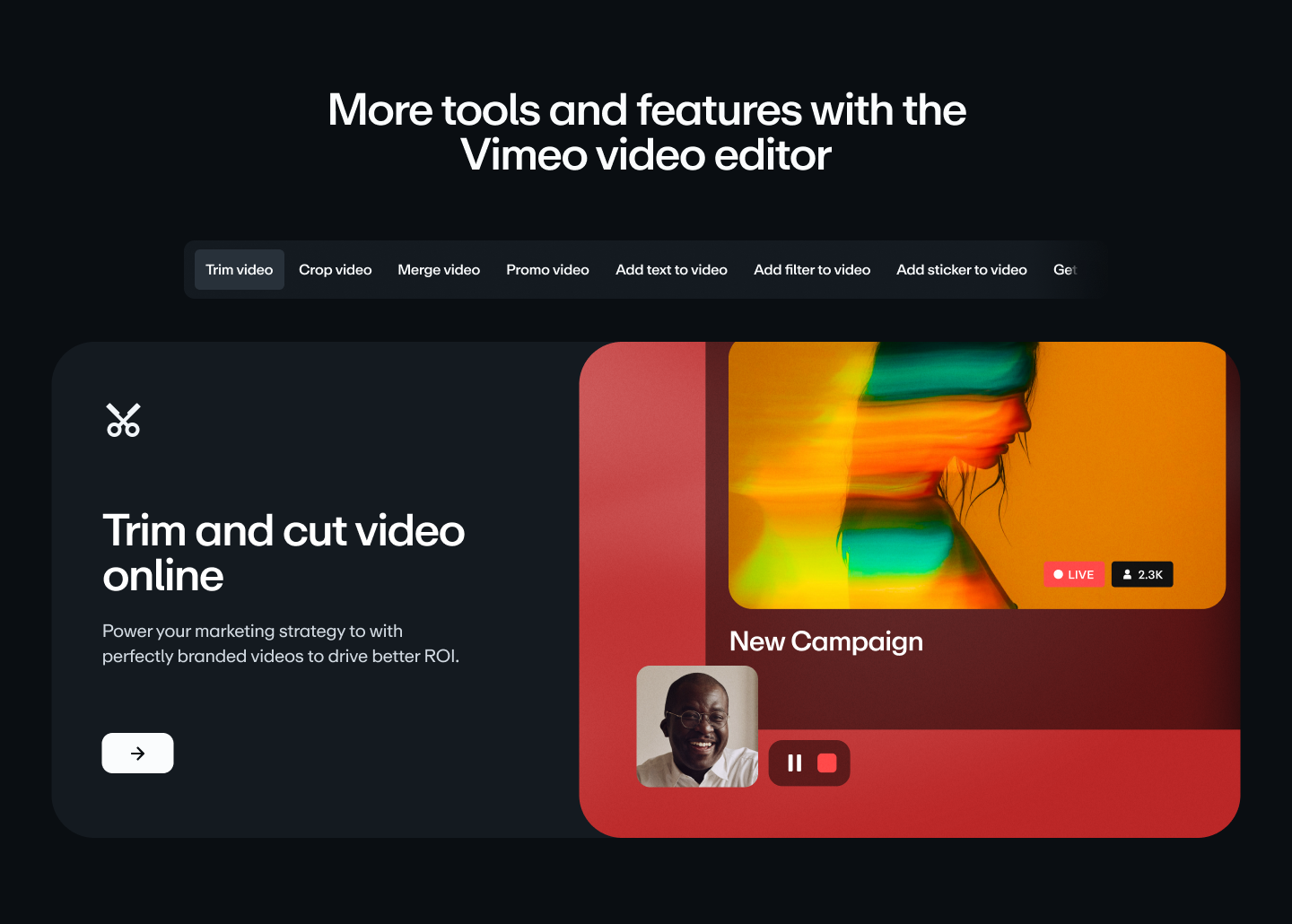
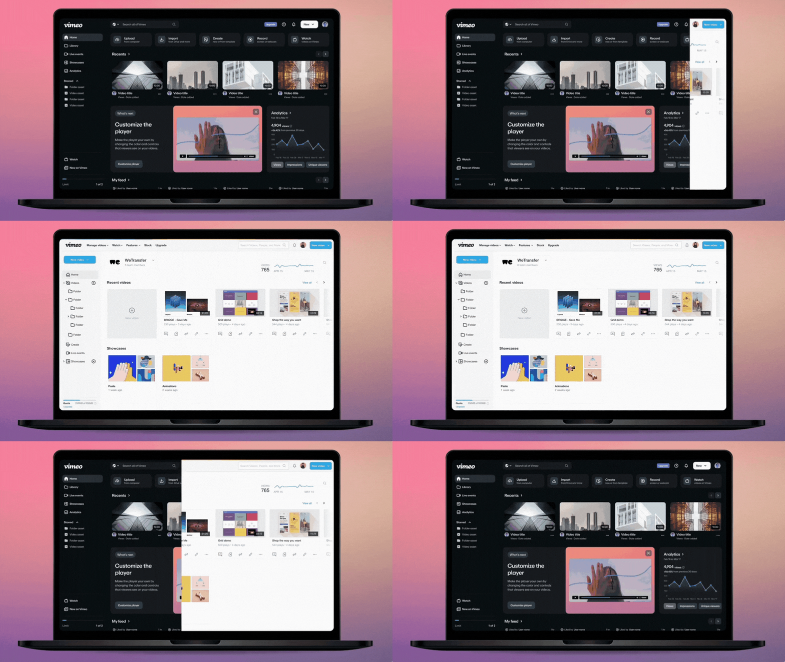
All UI elements should adhere to the themes of motion, bold colors, and roundedness. The elements should be optimized for both light and dark mode with striking accents from the vibrant color palette.


Challenge ✹ Solution
not intuitive
Communicated content more clearly
Provided content in an informative journey
Streamlined design and chose words intentionally
lacked confidence
Celebrated creativity and embraced change
Removed friction for the user and added control
Limited jargon and hyperbole
inEfficient
Showcased innovation and creativity in action
Used motion to guide users through interaction
Updated workflows, mindsets, & real scenarios
Design System
Create Focus
Through this redesign, we wanted to keep in mind some of Vimeo’s values and translate them into a modern rendition of the company. In order to create focus, we needed to communicate clearly what matters most. The UI needed to be simplified and easy to use with clear visual hierarchy. We made sure the users could focus on one piece of information at a time using simple headlines, bold visuals, scale, contrast, and framing techniques.
Stay Fearless
As a video platform, Vimeo thrives in being a force for creative expression. They embrace change and innovation while challenging the status quo. With bold typography and fresh interaction patterns, we found a balance in the mixture of clarity and abstraction.
Drive Progress
The user interface is an integral part of what makes Vimeo so appealing to users. We strived to honor the company’s goal to enable customization and control. The new design remains simple and confident while teaching users something new.

Be immersive
Vimeo’s interactive platform showcases innovation in action. The goal was to show users content rather than telling them how to navigate the interface. We wanted to uplift the content, captivate users, and allow others to experience video first. Fluid and in motion, the new UI is both interactive and responsive.

motion
an Engaging UI
There are two different easing curves that can be used for Vimeo products, and the best choice will depend on the specific animation and the desired effect.
Standard motion is typically quick and efficient. It should be subtle enough to not distract the user from their task, but noticeable enough to be easily understood.
Expressive motion is more noticeable and engaging. It can be used to add excitement, interest, or personality to a UI.

Mobile Design
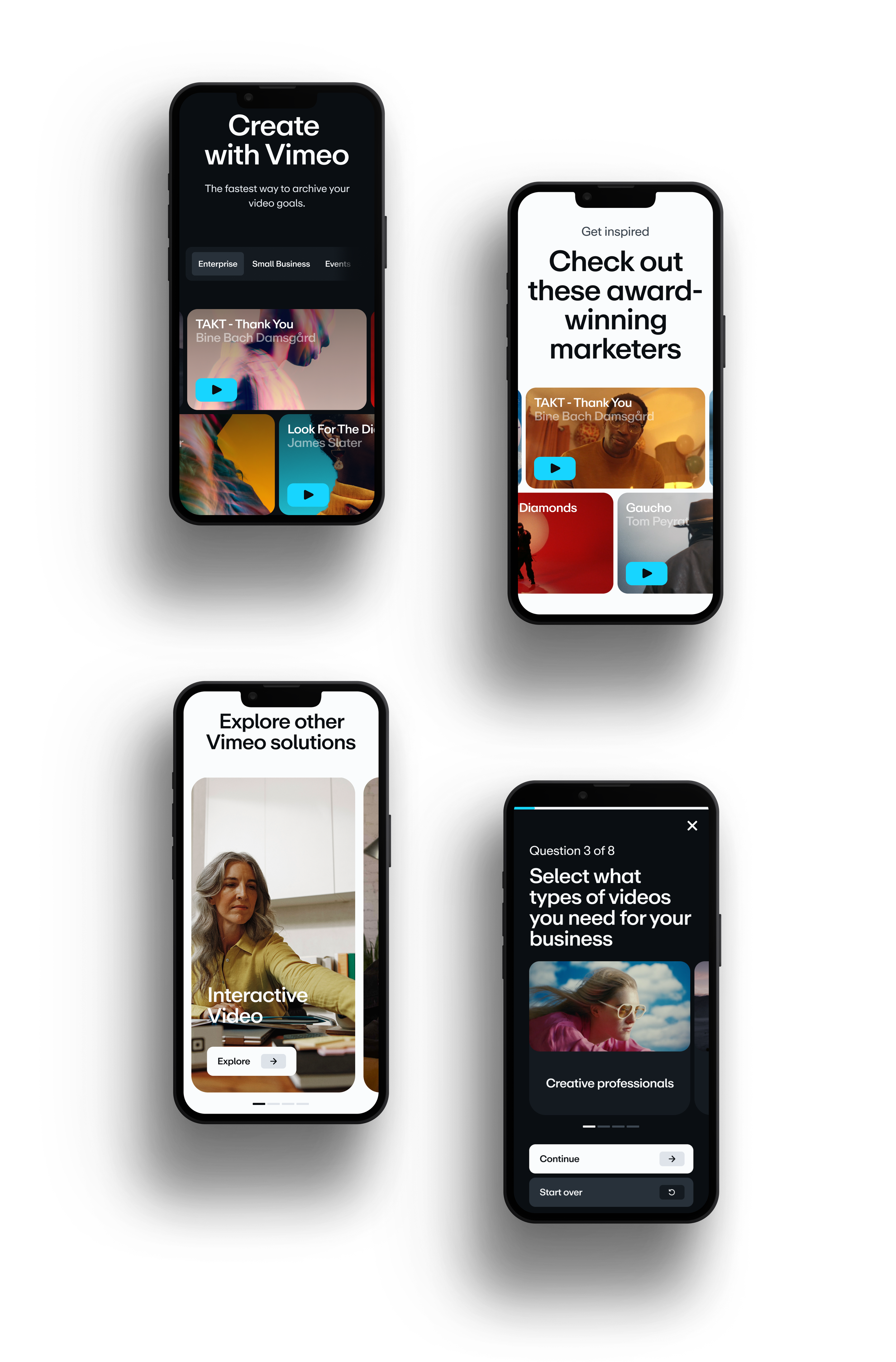
mobile layout
The layout system takes the Vimeo design patterns and builds on that system with a set of layouts that offers both flexibility and cohesion. There are five different ways to create layouts using the new visual system. These five styles can create a range of designs that all feel like Vimeo.


